The famous actress Larisa Golubkina anxiously keeps the memory of Andrei Mironov. In his office, she made a real museum, keeping the furnishings intact. For a long time, the artist did not dare to change the interior. But on the eve of the anniversary, she nevertheless turned to designers for help in updating her unique apartment. Today, in the HouseChief review, we will tell you about all the details of redesigning the kitchen-dining room, and also show what exactly the actress was unhappy with.
Read in the article
- 1 Apartment with a history before renovation
- 2 Stages of renovation work in the kitchen
- 3 The sequence of repairs in the dining area
- 4 Furnishing a kitchen-dining room in a classic style
- 5 Decoration and lighting of space
- 6 Summary
Apartment with a history before renovation
Larisa Golubkina moved to her apartment back in 1975. This spacious apartment is located in a high-rise just a few minutes' walk from the Russian Army Theater, where the actress has been playing her whole life.
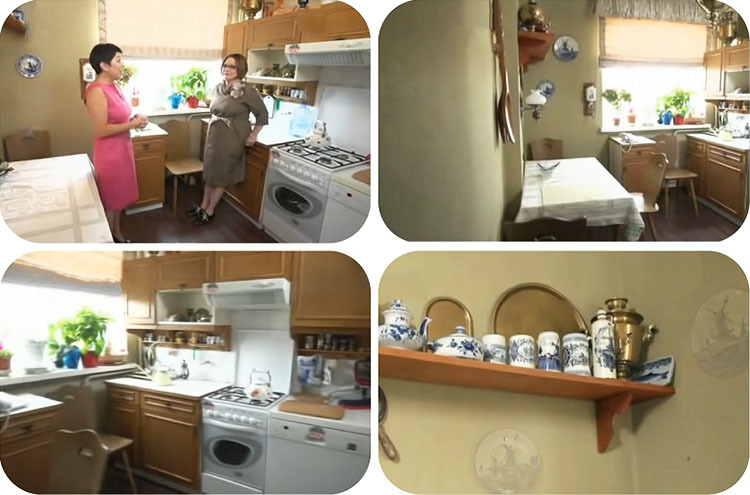
Larisa Ivanovna bought many things and decor items together with her legendary husband. For example, they got the kitchen set by great pull back in 1978, and until now the furniture has been preserved in good condition.

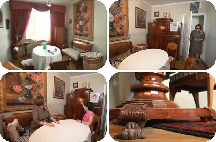
The designers decided to decorate the interior in the English style. Next to the 8.5 sq. m there is a small elongated living room, which is practically not used in the family. The ideal solution was to combine the spaces, for which the hostess had difficulty, but gave her permission. The antique buffet was transported to the country house of Maria Golubkina.
Stages of renovation work in the kitchen
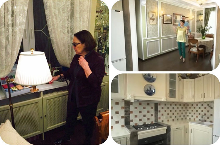
The builders removed the old finish and laminate. The partition between the dining room and the kitchen was dismantled. The wall was primed and leveled with gypsum plaster on the beacons. It turned out to be a large and bright room with two windows.
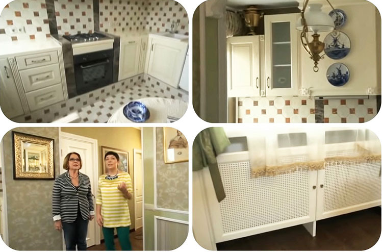
The kitchen was set high partition from gypsum boards. Cast iron batteries closed with perforated decorative screenpainted white. To increase the working surface, we decided to use a window sill.
Since the sill was located at a high height, it was necessary to raise the floor level in the working area using a mixture of sand, concrete and expanded clay. In the center of the kitchen, they decided to make a real hearth, the walls of which were laid out of gypsum plates. For the hood, a box of drywall. The surface was covered with a finishing putty and textured plaster. Slabs of natural marble were used for facing the inner and outer parts of the hearth.
For finishing the kitchen floor, podium and apron used ceramic tiles in the form of a honeycomb with brown inserts in the center. The walls were pasted over washable textured wallpaper marsh color. The portal next to the furniture was decorated with polyurethane capitals, which gave it a finished look.
The sequence of repairs in the dining area
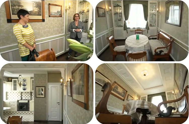
The wooden window in the dining area has been replaced with a modern glass unit. On both sides of it, cabinets were made of plasterboard on an aluminum profile. The lower part of the ceiling box was decorated with expanded polystyrene plates. According to the designer's project, squares were cut in the sheets, imitating caissons. Vertical and horizontal stripes were laid from the same material, dividing the wall into segments.
All surfaces were plastered and reinforced with mesh. For the highlighted lines and the hood box, we chose a textured titian-colored coating with a pearlescent velvet effect. To decorate the interior fragments, a light-swamp-like wallpaper with a white floral print was used similar to natural silk.
Furnishing a kitchen-dining room in a classic style
The classic English style kitchen was made of laminated MDF. Ivory facades are decorated with patina, decorative elements and spectacular handles with ceramic inlays. All doors and drawers are equipped with silent closers.
In the kitchen, in the dining area, they put a small round table made of solid ivory on a central leg. Its surface and frame are patinated. Placed in the dining room headset owners of the middle of the 19th century.
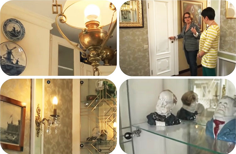
Mirror canvases were installed inside the cabinets in the dining area near the window. A huge collection of dishes and figurines that the hostess collected for many years was placed on glass shelves. The doors were decorated with a ribbon imitating real stained-glass windows.
Decoration and lighting of space
The window in the dining room was decorated with snow-white tulle with satin ribbon decor, thanks to which you can make beautiful draperies. Additionally, we fixed more dense dark green curtains and a lambrequin. Hanged in the kitchen roman blind Larisa Golubkina, who was even before the renovation. It is sewn of dense sand-colored fabric and trimmed with wide piping.
In the dining area, graceful sconces made of bronze-like metal and decorated with crystal pendants were hung on vertical moldings. A central chandelier was chosen in the same classic design. The lighting is supplemented by LED lighting around the perimeter of the plasterboard box.
A chandelier from the previous interior was hung in the kitchen. It was bought by Andrei Mironov in Rostov-on-Don. Open shelves and top panels of cabinets were decorated with a personal collection of samovars, with which the genius artist moved to this apartment.
Summary
Larisa Golubkina was delighted with the interior of the renovated kitchen-dining room. At first glance, everything was done flawlessly. However, after a while, in one interview, she said that she was disappointed in the repair. The fact is that the kitchen furniture was raised to the podium, but they did not take into account the low growth of the hostess. And the flooring in the work area also left a lot to be desired.
Tell us in the comments what impression the updated interior made on you and whether you agree with Larisa Golubkina.
He is a narcissist, he is everywhere: in the jury, in the "lights", at presentations, and last of all ...
Terrible! Cold and not cozy! Maybe it matches the character of the owners. But, how to say ...
It's time for the actress and herself to be put in order. Remove these terrible curls, really human ...
Very nice, I liked it. Just how long is it for her?
Don't be born happy, but be born talkative.
The apartment was not impressed, but the main thing is for the owner to feel comfortable in it! Photograph ...
I would have been younger, so that I have such a bed.
I saw how people build interesting terraces. I wanted to build too. I figured out the financial ...
Sabbat workers build houses from timber of natural moisture. Then shrinkage occurs and it is necessary ...
We painted ordinary paper wallpapers with a special paint for wallpaper. And the chorus looks like ...
I remember they decided to paint the radiators at home, and decided to take not enamel, but colored paint. sconce ...
I really enjoyed working with Dulux paint. Any color can be found (which between ...
It was not the sage who said this, but Kulich, he is Lukich ...
Well done, Alexander Glebovich! Talented writer, journalist and TV presenter. My applause ...
Let ballet, beauty, art, kindness be crowned, than anything else
Better to be crowned ballet, beauty, art, kindness than anything else
So there is no mention of the working area at all. The tool is hung / laid out. But where is the work ...
The most important thing is missing - a bench vise. This is a special area where p ...


