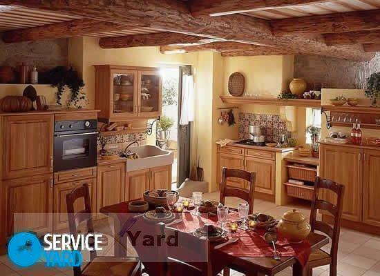
Although the blue color and is considered the "favorite" a touch of humanity, its use in the interior does not always create comfort in the room. Why it works out that way? The reason for this was the "cold" colors. Blue has many gradations, but from it all the same a little "pull" frost as from an open window in winter. Not to deny yourself the pleasure to issue a room in your favorite shade, it must be diluted with warm spectral opponents. Blue kitchen interior is considered a controversial decision that requires a lot of skill decorator. Not every newcomer will be able to feel the subtle colors and find the right combination of colors within it. Let's talk about the tricks and features of using blue for the room, which should prevail atmosphere of culinary inspiration.
Content
- Features and psychology of color in the kitchen
- Pros and Cons of blue decoration
- Variety of colors
- The combination of color and style
-
Combination with other colors
- Facades kitchen units
- The walls are in blue
- Textile
- conclusion
Features and psychology of color in the kitchen
Color blue is associated with ice, water and sky. He generously used by nature in the petals of flowers and bright plumage of birds chirping. Blue choose restrained, strict and slightly closed people who are not alien dreams. As a rule, they are slightly obsessed with your inner world, but at the same time have a rich imagination. In many cultures, blue is used as a symbol of loyalty, constancy, and eternity. In the design of its classic dark shades are ideal for solid style: Loft, Scandinavian, modern, high-tech. Lighter colors (blue, azure, turquoise) are used in playful ways: Provence, Shabby chic, eclectic.


In addition, various shades harmonize with several ethnic styles, which are so suitable for processing suburban "apartment" and country houses. Color soothes, promotes relaxation, but it is not heated brain activity and suppresses appetite. With the last nuance and connected the main difficulties in the use of blue kitchen interior. On the background of the food it does not seem so appetizing and attractive. Of course, many may rejoice, because blue is ideal for those who want to lose weight. But we should not delude ourselves. Hunger will cause a sharp deterioration in sentiment in the wrong kitchen design desire to go completely lost. It kills the appetite only classic blue, his dark shades of indigo, and violet. Blue, for example, in combination with yellow, on the contrary, will create a cozy and "juicy" situation. Psychology blue contradictory. What will the color largely depends on its partners.


Pros and Cons of blue decoration
Color can not be used in excess in the small kitchen. Blue has the unique ability "to land" and burden the items that decorated it. So the room will become even narrower and smaller. In addition, the dark shades of blue create an oppressive atmosphere. Very different perceived color in the spacious kitchen. He seemed to be doing their endless especially when applied to smooth, glossy surfaces. Achieve comfort in these areas is very difficult due to the psychological discomfort. It is therefore necessary to find a delicate balance, color balance in the development of a design project.
See also:How to make the design of the kitchen in a modern five-storey apartment


It does not recommend the use of cool colors kitchens, windows facing the north side. In this case, the lack of sunlight is necessary to compensate for warm tones, and not to aggravate the situation the blue walls or kitchen units. The only exception will be the accent surfaces and parts: an apron made of ceramic tile, countertop in a dining area, a refrigerator door, hood, sill or textiles (curtains, tablecloths, towels, pot holders, mats).


Variety of colors
Blue has a lot of shades, each of which is unique. Midnight recalls the endless starry sky with bitten a yellow disk of the moon. Ultramarine is similar to the shimmering sea depths at depth. A gray and blue color of steel recalls the splendor of metal surfaces and perfectly combined with modern steels. Cornflower got its name from the eponymous color, fluffy heads are bright spots dot the field carpet. Although Azure itself is a shade, it has an internal gradation on tone: light, dark, Berlin and with a touch of gray. Heavenly and blue differ tenderness and unlike classical or royal blue, they are soft and pliable, which pronounced in combination with warm colors.


Sapphire transmits the full depth of iridescence on precious stone faces. He advantageous to look in the glossy surfaces. Lightweight denim naughty or protective shade becomes flirtatious note in design pattern. We should also mention the mixture of blue and green, which translates into a fancy color aqua, cyan, turquoise. Shades occupy a borderline situation, but at the same time perfectly harmonize with its immediate neighbors on the spectrum. On the other hand, blue bordered with red, resulting in an incredibly elegant in its beauty lilac, lavender and purple tones.


The combination of color and style
Dark blue, royal, midnight, royal, along with snow-white surfaces and the decor will join the great futurism, hi-tech, Scandinavian style. Shades acquire depth if they are used in glossy surfaces chameleon. Sky white base will be the base for marine areas. Balance the severity contrast yellowness ropes, browns wood decorative wheel, sandy shades of gray pebbles. In Provence and white classical style combined with ultramarine, royal, azure, sapphire, lavender, deep purple. More "faded" blue shades are used in Mediterranean cuisine.


A similar color scheme accentuate the features of the Greek climate and create the illusion of constant contact with the surface to be decorated mercilessly scorching sun. Noble, deep tones suited to the American Art Deco. Stylize situation under Russian village received by the brown tones of wood and the blue-and-white painting, which is used in Gzhel motives. Open to various experiments eclecticism is happy to accept the interior of the ocean and celestial notes. The loft is used both light and dark shades of blue. It all depends on the room size and the color of the embodiment: the headset, in finishing accent wall or decorative details.
See also:Small kitchen: design and layout


Combination with other colors
Blue forms a perfect tandem with yellow, gray and white. In the latter case, you can use a combination of both modern and classic design. If two base color is not diluted, it will turn a solid, slightly bluff interior. To add softness to it, use a beige, cream, coffee with milk, hazelnut, sand. With the gray shades of blue will play quite differently. Lost a bright contrast. But at the same asphalt, steel, nickel, Marengo, silver will be able to emphasize the particular nobility of blue. The combination of the heavenly, blue, classic or royal yellow is considered one of the most well-established. Both components of the tandem heat and cold stress each other, and "temperature" as a result of a combination of moderate obtained.


Yellow resembles the sun, and blue - sky. Duller "sand" colors will be associated with a beach which is washed by the blue waves of the sea. In this combination, there is a positive, and self-restraint. The duo of blue with green is considered to be a controversial decision. It is very difficult to implement, without prejudice to the visual perception of a small space. Blue and black create a very complex combination of which the kitchen is not generally recommended to embody. Against the background of royal or midnight black shade will become unpleasant, mournful notes. In alliance with the somber blue color is used only in the details. This combination necessarily mitigated by the perfect white background, but in general the interior to get a solid, restrained and very elegant.

With extreme caution should be used orange and blue. The first is too aggressive in its brightness, and the second "cold" interior. Since both the dominant hue, they are not complementary, and cancel each other out, creating a very controversial color composition. The experiments on combining colors better spend in another room, but not in the kitchen.


Facades kitchen units
Now facades of kitchen sets are performed in the most unimaginable colors. Fully Blue furniture set is not suitable for every interior. An alternative option would be the purchase of a headset with a combination of colors on the facades. Alternatively, the lower part of the furniture is done in blue, and the top - in brown or white. Such a solution will gently introduce sophisticated hue range of interior paints, but it does not spoil the composition. If the kitchen is made according to the principles of modern trends, high-tech, minimalist loft or, it would be logical to use the glossy surface of the facade. In combination with chrome decoration and handles, you get a stylish and at the same time elegant option.


For classical directions selected matte surface that combines with the wooden elements. Provence is suitable for antique set, which casually facades painted in sky blue, azure, sapphire color. Their further decorated with color images in the art decoupage. Completely blue with white tops set in harmony with the pastel shades of wall decoration. Considered controversial embodiment staining their surface in dark tones. This solution can be implemented only in a very spacious kitchen. For rooms where every free meter counts, this method of registration falls under a strict taboo.
See also:75 examples of a kitchen in the loft


The walls are in blue
Blue wall as background suitable for white or light-brown kitchen sets. Alternatively, you can use different colors: azure, celestial, ultramarine, to create a color gradation. Good on a blue background will look headsets, partly in sunny shades of yellow. Walls can be painted, cover usual or textured plaster paste over the special vinyl wallpaper, ceramic tiles, which is ideal for kitchens and bathrooms.

Apron usually decorate small fragments of tile mosaic in the art. In such an embodiment, it looks good coupling pieces, made in different shades of blue from light blue to deep and midnight. In this case, the walls set off by a white stucco ceiling and window / door frames in the same color. If the kitchenette is small, it is recommended to use only one blue accent wall. Try to avoid the registration of the color surfaces, which are adjacent to the dining area. Remember that the food on a similar background look very unappetizing.


Textile
Blue textiles, perhaps the best solution for small kuhonek. Decorative elements can be easily removed and replaced on the other, if the composition does not look very nice. This is the easiest way to make a controversial hue in the color scheme of the interior. Blue curtains in alliance with white window frames and garters to match make the situation more severe food. If they will decorate floral pattern, such textiles come to the line of classic styles.

Tablecloth and curtains in flirty blue and white squares will look good in Provence, and country. They are sure to complement the other elements of the village: forging, painted pottery, rough wooden details. It is also suitable for such textiles openwork lace white. Blue kitchen towels, pot holders, aprons will be nice addition to the eclectic cuisine. Heavenly upholstered chairs complement as the classic interior, and easier registration in rustic or delicate Shabby chic. Panel curtains dark blue hue suited to futuristic and minimalist kitchens.

conclusion
Do not get hung up on the "coolness" of blue. He is multi-faceted, as a sea wave or play in the heavenly depths. For registration it is chosen only self-confident people, for whom the house is really a fortress of peace and tranquility. Blue can be luxurious, stylish, flirty, cute, serious, even grim. What kind of emotions will cause the color depends on the rest of the environment. In this respect, like a blue gem that is in the original cut will be a truly gorgeous decoration worthy of crowned heads. Not for nothing that one of his precious hues called royal.