Golden Section for centuries as a symbol of harmony, ideal proportions in environment and in many areas of human life - the hard sciences, music, art, architecture. It is taken into account in the design - it is assumed that the closer to the ideal opportunity to object proportions, location objects relative to each other, the better this interior is perceived by the human brain, the more comfortable it be. On the golden section in the interior design and landscape, its use cases in detail in the text of this article.
Content
-
What is the "golden section", as it appeared?
- Spiral golden section
-
Using the golden proportions in the interior of your home, apartment
- When planning space
- Golden section in the size ratio
- Golden section in color
- Golden section when selecting altitudes
- Golden Section in furniture, decor
- Golden Section in landscape design - how to use
- Where is the golden ratio is used more
- conclusion
What is the "golden section", as it appeared?
Gold section - the so-called "divine proportion", viewable in most natural objects: shells shellfish, tree leaves, bee honeycombs, the structure of flowers, spider nets, human body, DNA molecules, bird eggs. Also, it is observed in the geometry of the Egyptian pyramids, many ancient sculptures, paintings of famous artists.
The very essence of the "golden ratio" - the division of the whole into two unequal parts. The ratio of smaller to larger parts, and more to the whole, appears as 0.618 to 1.0. Monk Luca Pacioli explained it as "divine trinity": a smaller part of the whole - the Son of God, a large - God the Father, and the whole - the Holy Spirit. Who first started to use it, it is not known, but the most accurately described by Leonardo da Vinci. There is an assumption that good painters, musicians, architects and other artists are using the golden ratio intuitively - it so it turns out beautifully.
A special case of the "divine proportion" - the rule of thirds. It is caused by human visual perception - when looking at the picture, "clings to" the eye in the first place for the top four points on the intersection of the vertical line with the horizontal, provided that the pattern is divided into nine equal fragments. It is within these points are placed the main emphasis on images, its subject center.

Spiral golden section
By "divine proportions" refers to both the so-called Fibonacci series or Fibonacci spiral. Medieval mathematician was a sequence of numbers, the following: 1, 1, 2, 3, 5, 8, 13, 21, 34, 55, 89, 144, 233, 377, 610, 987, 1597, 2584, 4181, 6765, 10946 etc., Where the sum of every two numbers that follow one after the other, starting with the second is third. A striking example of the Fibonacci sequence - human finger phalanges, the ratio of first to second and third. Fibonacci spiral visible when viewed from the top of the flower of sunflower, pineapple lumps. Most shells of shellfish, goat horns mountain and meet them.
See also:Decorative tiles under the stone 60 photo examples

Using the golden proportions in the interior of your home, apartment
When looking at the beautifully landscaped home interior, the first thing that catches the eye - it is easy asymmetry, subtle confusion. And decorated according to the golden ratio, gives a sense of calm, tranquility. Ideally shaped indoor width to length ratio is 5 to 8, or 1: 1.62.

In the early 20th century, for planning human living spaces acceptable, the architect Le Corbusier invented a system of anthropometric proportions called "Modulor". It is a stylized figure of a man with his arm raised. Growth, the proportion taken common, average, initially they were used in the construction of the first apartment buildings.


When planning space
On the stage of calculations drawn plan, which is divided into parts according to the principle of the "golden" spiral. Zoning space, especially large, carried out in strict compliance with the points of intersection of the main lines - here arranged the furniture, screens, screens or partitions in a studio apartment. The main emphasis, which want to draw attention, and placed in the data points.
When in the house a lot of space, they can also be an ideal plan: while the largest room will treat the entire area apartment as a 0.62 to 1, the smaller - just to the area of greater food - to a smaller room, hallway to the kitchen, bathroom to the hallway, balcony - a bathrooms.

If you use your growth as a module, when building a house, then the space is easy to "fit" for themselves.


Golden section in the size ratio
It is desirable that the sofa is not served more than two-thirds of the wall, near where he was standing, and a coffee table - a maximum of two-thirds the size of the sofa. The height of the bedside tables with lamps located on them, select 2/3 height wall.
Large dark objects placed below, small, lighter - up, creating a kind of a sense of peace. Any long stretches, from top to bottom, creating oppressive impression rising - on the contrary. Pictures of different sizes should be carefully selected with respect to each other, hang out at the appropriate height.
See also:Textiles in interior

Most of the composite rectangle should be the most intense, lit.


Golden section in color
It looks very harmonious space, where 62-65% of the space is given to the main color, the remaining 35-38% - secondary and up to 5% - a variety of accent colors. Pasting wallpaper the walls in different colors, but of similar invoice, made by the same principle.

It includes secondary color to the three colors, and accents in some cases up to 10% isolated space.


Golden section when selecting altitudes
The height of the bedside tables with lamps located therein, is chosen at the rate of 2/3 of the wall. If the selected wall coverings of plastic, wood paneling, ceramic tile, it also takes two-thirds of the height - the rest goes for painting, wallpapering. Approximately one-third of the height of the cabinets occupy sofas with backs, kitchen countertops, and The low "eastern" tables - one-third of their height.

The lower point of all ceiling lights not dipped lower than five-eighths of the height of the room. If this proportion can not comply, then the location of fixtures "tied" to other interior items. Standing next to each other have the same type of decorative elements also correspond to each other as 1 to 1.62.


Golden Section in furniture, decor
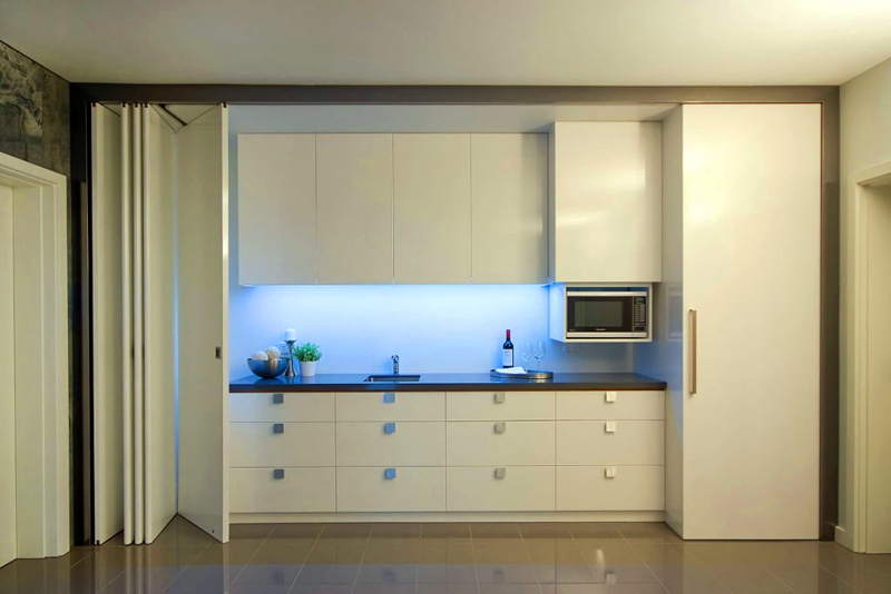
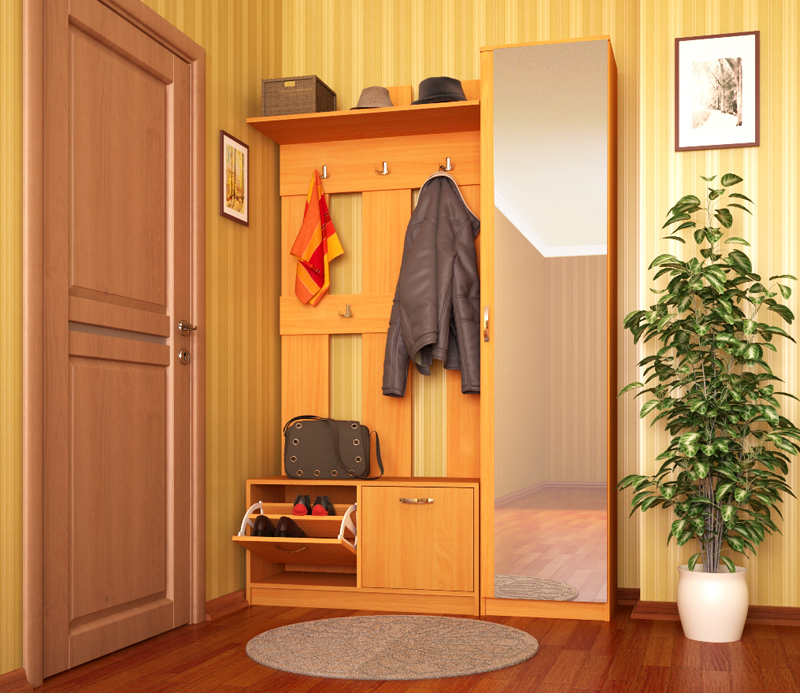
In the disposition of furniture should be aware that it took no more than 65% of the area of the room - otherwise the room will look cramped. The ideal amount, the dimensions of the furniture is calculated from the size of the largest of its items - cabinets, sofas, a large table, kitchen units. For example, a case-wall takes two-thirds of the room, while a sofa bed will 2/3 the size of the cabinet. In the same way the table will refer to the sofa, chair to the table and chairs to chairs and others. Large decorative elements are duplicated at different points in space such as a small, but with observance of proportions.

Some companies produce entire sets of furniture, correlated with each other in height, dimensions.


Golden Section in landscape design - how to use
Application of the methods of "divine proportions" in the design of gardens, city parks are also justified. Favorite ratio for most designers - 8-5-3, it usually refers to the area of the common space of lawns and garden paths. The best solution would be symmetric and where the central and lower parts are equal, and each of the lateral half is larger. A striking example of this - a star inscribed in a regular pentagon, in which the ratio of the diagonal and the side corresponds to the "gold" in the proportions.
See also:Concrete in interior - fashion trend in finishing 30 photos examples
There are some other options:
- linear, aerial perspective - is a visual change in the size, clarity in the case of increasing the distance. It seems that parallel lines converge in one - thus gradually narrowing the track, give the impression of more space than there;
- subordination, unity of form - selection of accents, the ratio of the height of plants, garden sculptures, outbuildings;
- the balance of composite solutions - is allocated a significant center and in relation to it all other objects are placed, taking care not to overload one or another sector of the garden.

When planning your landscape, you should consider the basic "plot" line, stylistic design direction, the relationship not only of all sizes, but the color "spots".


Where is the golden ratio is used more
Golden Section proportions person most accurately depicted in the "Vitruvian Man". They are used in the graphic design of the modern world. The Apple logo is guessed "trimmed" spiral, Fibonacci circles, and the Toyota badge design is made up of ovals carefully inscribed in a rectangle, in accordance with the Golden Section which is also guessed and Logo:
- BP,
- iCloud,
- twitter,
- pepsi,
- Grupo Boticario.


For correctly handling sites, web pages, also applied the principles of spiral - the most important content is placed in the center, located usually in the upper left-hand or right-hand side. Clarity, intuitiveness, the emphasis in certain places - the main credo of such clearance. The best form of rectangular images - the ratio of their sides, tending to a ratio of 1 to 1.62.
The use of ideal proportions in the text divides it into two unequal parts, each of which has its main idea, plot. About the same principle based soothing "miraculous" effects of folk charms, prayers.
The "newspaper" modular design creates grid in accordance with the "golden" proportions. Compliance with the rules of the golden section in the clothes, choosing shoes, hairstyles, and will benefit the general appearance of the human mind. The music is one of the ideal techniques, rapidly developing relations called "crescendo".

conclusion
"Divine proportion" surround man all over the place, delighting the eye, creating comfort in life. Its principles are used by professional interior designers in the placement of objects, modeling forms the premises, planning the landscaping of land. If desired, the "golden" proportion to their own houses, apartments, garden, easy to calculate on their own, with the help of online designers and calculators that are present in the interface of some site design.


