A few years ago, Svetlana Abramova lived in two cities. During the filming of the popular TV show "10 Years Younger" she came to Moscow, and after them she returned to St. Petersburg. In her hometown, the TV presenter was waiting for her cozy apartment, on the design of which the best decorators worked. Today, in the HouseChief review, we will show what can be done in an ordinary standard kopeck piece and how the disadvantages of the layout can be turned into advantages.
Read in the article
- 1 Long-awaited purchase of an apartment
- 2 Coordination of the design project
- 3 Functional separation of the kitchen-living room
- 3.1 Recreation area decoration
- 3.2 Original accents in the kitchen area
- 4 Cold scale in the bedroom
- 5 Solemn bathroom interior
- 6 Summary
Long-awaited purchase of an apartment
Svetlana fell in love with Vasilievsky Island in her student years. She had been dreaming of buying an apartment in this area for several years. Every little thing was important to the TV presenter: a good view from the window, a neat entrance, the ability to make a separate dressing room and, preferably, floor-to-ceiling windows.
An apartment that fully meets Svetlana's requirements was found in a new residential complex not far from the Erarta Museum of Contemporary Art. 70 sq. m were rented out without finishing, which made it possible to embody all design ideas. For help in decorating housing, the TV presenter turned to the St. Petersburg studio.
Coordination of the design project
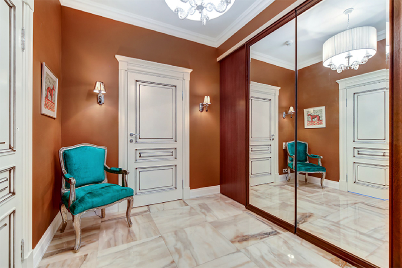
Svetlana's Moscow apartment is decorated in provence style. In the St. Petersburg apartment, the TV presenter dreamed of seeing modern neoclassicism with notes of eclecticism. Such a design, in her opinion, is best suited for the Northern capital.
The choice of shades was no less important. They decided to make the kitchen-living room in a muted coffee-violet tones, for the bedroom they chose a marine palette to match the island and the city. Glossy surfaces became the main accent, which brought a solemn mood to the interior. Svetlana gladly took part in the development of the project and supervised the procurement of materials.
Functional separation of the kitchen-living room
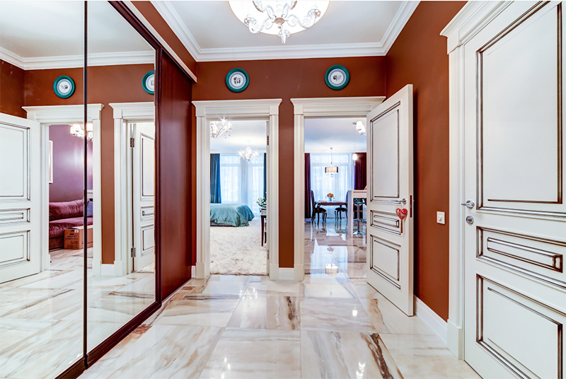
To the floor throughout the apartment laid porcelain stoneware with spectacular streaks in brown tones. The wall between the rooms was dismantled and rebuilt, but with an original secret - a niche was made in it. From the side of the bedroom, a ledge turned out, which was beaten fireplace. Household appliances were installed in a niche in the kitchen.

Recreation area decoration
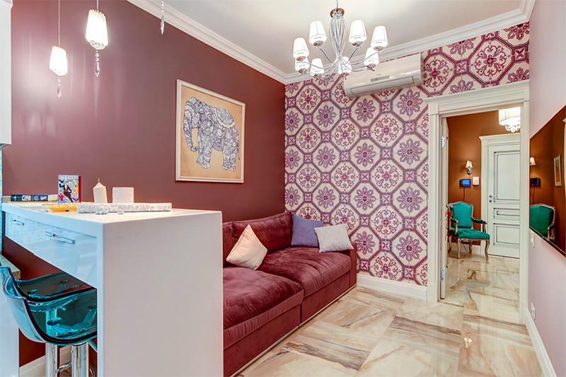
They decided to visually correct the narrow space of the kitchen-living room. bar counter. The recreation area is located closer to the entrance; a kitchen corner has been designed near the window. The functional areas were highlighted with the help of shades: the walls near the sofa were painted in terracotta color, the dining group - in light purple tones. For the entrance area we chose wallpaper with geometric ornament, the color of which is in harmony with the general background.
A large sofa with wide armrests was placed in the recreation area. The upholstery made of natural dusty pink velvet is effectively combined with decorative pillows in lilac and light beige tones. A huge plasma was hung in front of the recreation area.
Original accents in the kitchen area
A small suite with glossy ivory fronts was installed in the kitchen. A glass-ceramic panel and an integrated stone sink. For the decoration of the apron, a mosaic in blue tones was used. Illumination at the level of the upper modules and built-in hood creates a beautiful play of light in the work area.
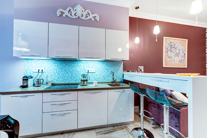
For breakfast in a narrow family circle, a bar counter is enough, for which high chairs with plastic translucent turquoise seats are ideal. For more solemn receptions, there is a dining table on curly glossy legs. Medallion chairs with purple upholstery add to the festive atmosphere.
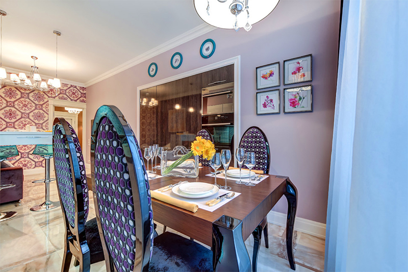
Several kitchen modules were installed in a large niche, as well as all built-in household appliances. Glossy facades with a natural wood structure look like a spectacular wall panel. For window decoration we chose snow-white transparent tulle and beautiful curtains made of deep purple fabric with glitter.

Cold scale in the bedroom
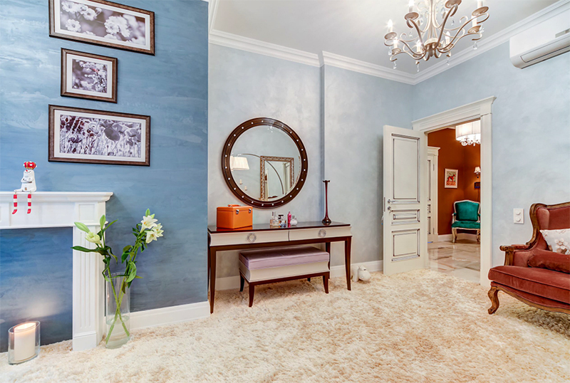
The interior in the bedroom is made in cold colors and is more close to the Art Deco style. Marine theme with turquoise hues perfectly conveys the mood of Vasilievsky Island. A light beige carpet with a low pile gives the impression of a sandy sea shore.
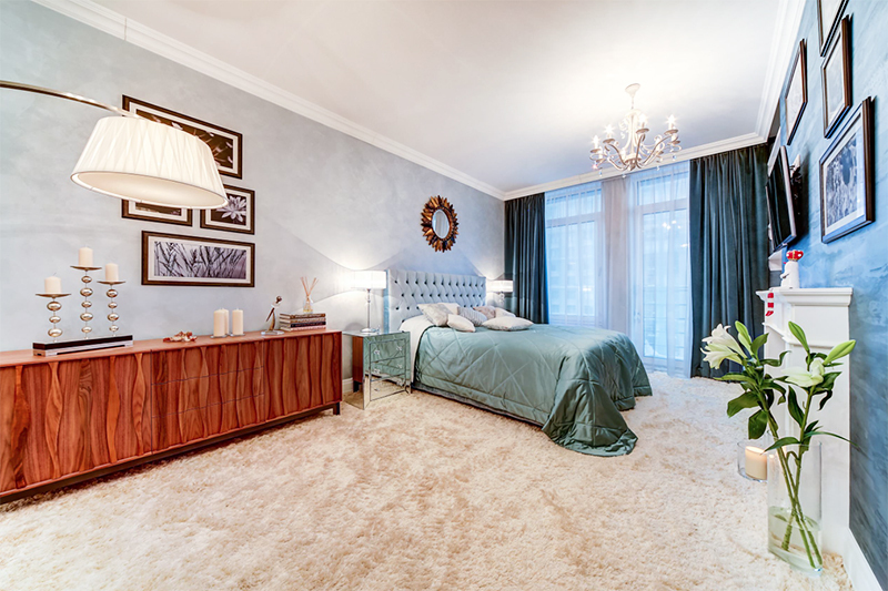

For the walls of the bedroom we chose decorative plaster in two shades. Behind the headboard, they made a lighter color, the accent surface opposite was highlighted with a dark blue palette.
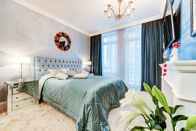
Svetlana dreamed of a large bed with a high sky-blue headboard, decorated with a carriage coupler for many years. It took about six months to wait for the production of such a model, since the fabric was brought only on order. Unusual bedside tables with mirrored facades make the interior of the room even more airy.

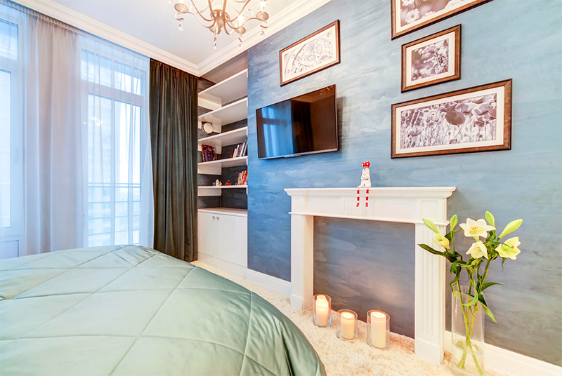
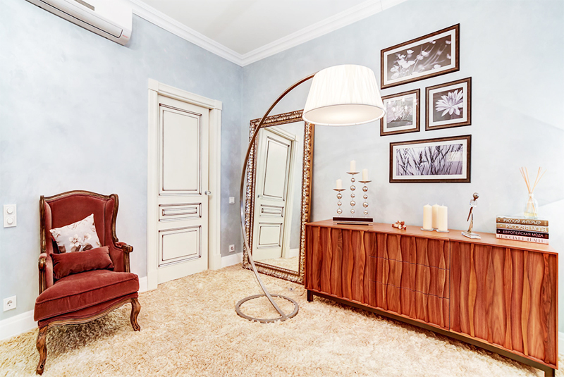
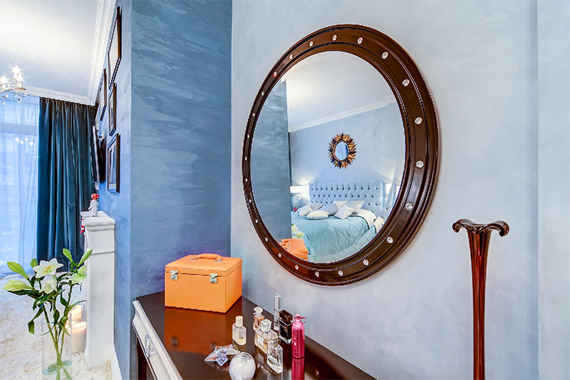
A fireplace portal was installed on the opposite wall, which Svetlana decorated with decorative candles. In the opening next to the window, open snow-white shelves and a closed lower section were fixed. A dressing table with graceful high legs was placed near the entrance. Above it, like a porthole in a ship's cabin, rises a large round mirror in a wooden frame.
Solemn bathroom interior
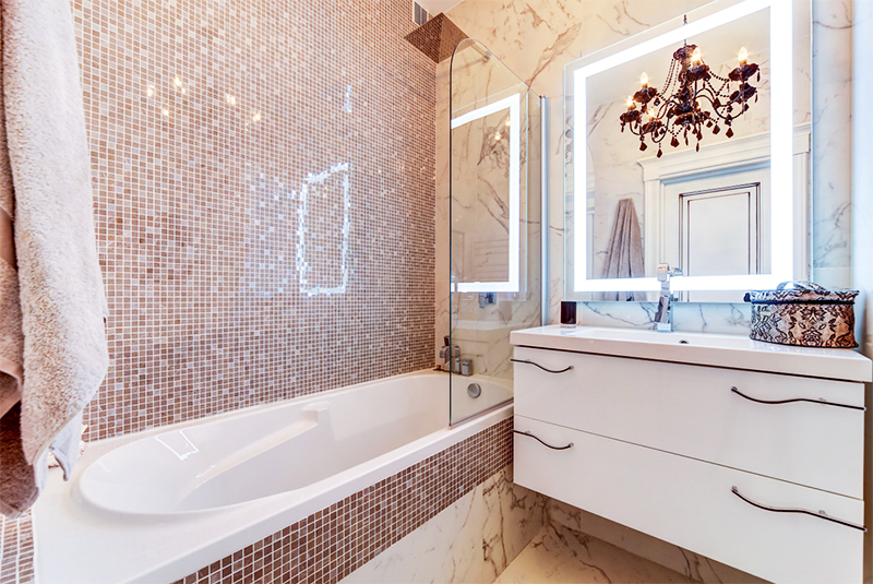
To decorate the walls in the bathroom, we chose a mosaic in light brown tones. A deep oval rain shower bowl is separated from the general area by a glass partition. A hanging cabinet with an integrated washbasin was installed nearby. A large perimeter LED mirror was hung on the wall.
Summary
If all the repairs in Svetlana Abramova's apartment lasted about three months, then it took a whole year to buy furniture, textiles and jewelry. The TV presenter understood that if everything was not completed before the move, the imperfections would remain for a long time. She has carefully selected every cutlery, crockery, paintings and other decor that makes the interior incredibly cozy.
Tell us in the comments how you were impressed by the designers' original idea of moving the wall between the living room and the bedroom.
I like it very much, well done Julia Baranovskaya.
The title of the article promises accessories for organizing order, but in fact cardboard for rice ...
Brains are felt in everything. Even in the apartment (choice of a house, method of obtaining, footage, oh ...
Smart guy. I did not take a mortgage, but bought it out of a communal apartment, well done. And the 100m did not become ...
The author of the publication is RIGHT!!! They fight with us everywhere and for everything, and for which we are not obliged to pay ...
I would not call all the persons listed by you as descendants of Lenin. They may be called ...
I rarely write SUCH a comment but... Great article! And I really don't know a lot ...
I was also interested in the topic of the article, lavnoe, she calmly talks about the family of V.I.L ...
I completely agree with you. interesting, informative article, it's a pity that I don't know much ...
Lenin looks like dad - Ilya Nikolaevich, especially with the eyes of the Kalmyk type, like his ancestor ...
If I were you, I would solve such a question with competent people who understand this ...
so write those whom neither dogs nor people have ever loved.


