Evgeny Popov and his wife Olga Skabeeva are professional journalists and the main hosts of the 60 Minutes program. This married couple, despite their popularity, tends to lead a closed lifestyle and does not advertise the relationship. And what kind of interiors TV presenters prefer can only be concluded from a few photographs on their social networks and from episodes of the program “When Everyone is at Home”. Olga and Evgeny prefer a simple but stylish design - the apartment is decorated in laconic beige shades, with the addition of dark brown and gray.
Read in the article
- 1 Stylish living room interior
- 2 Combination of dark and light shades
- 3 The apartment is a place to relax after work
Stylish living room interior
When choosing an apartment in Moscow, Olga and Evgeny were guided not only by their own interests. The couple has a son growing up, and it was important for them to create comfortable conditions for him. The presenters themselves spend very little time in the house, since they record broadcasts all the time. Thinking through the interior, they chose the most simple shades of walls and furniture so as not to overload the tired brain and create a cozy space for relaxation.
They managed to complete the task - there are no bright spots and gaudy details in the house - everything is very concise, strict, but tasteful. The interiors of the house are clearly visible on the frames from the TV show "So far, everyone is at home", and on the video from the blog you can notice the son's room - like the rest of the house, it is decorated in white shades, but forced toys.

TV presenters did not save on repairs - despite the apparent simplicity, the interior is quite expensive and stylish, and every detail is tastefully selected. The main shades prevailing in the interior are pastel. It can be concluded that most pieces of furniture are designer, since it is impossible to find similar models in mass-market stores.

Combination of dark and light shades
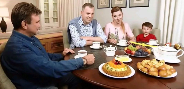
In order for the apartment not to resemble an infirmary, Olga and Evgeny decided to dilute the white details with darker ones, adding high-quality dark wood furniture. So, in the living room there is a large round table, and to complement the interior, photographs were chosen that hang in frames on one of the walls.
The interior combines several shades: white and beige (basic) and additional ones: gray, brown, black.
The apartment is a place to relax after work
The son of Olga and Eugene has his own room, which he furnishes the way he likes. The room, like the rest of the apartment, is very light and comfortable. Zakhar chooses for himself the toys that he keeps in the room - one of his favorites is a big teddy bear.
It is impossible to find lurid luxury items throughout the house - expensive gilded frames, statues and columns - instead, Evgeny Popov chooses comfortable furniture and decorates the living room so that it would be comfortable for the whole family to be in it, drink tea and discuss the latest news. The whole design can be described as "modern classic".

The main feature of the design is that the same design style is maintained in all rooms, and it is impossible to get confused when moving from the living room to the bedroom. This is a common phenomenon for many apartments - when each room is designed in some separate style, which does not always look stylish.
To finish the bedroom, a contrasting navy blue was added to beige and brown, which is ideal for relaxation areas due to its calming properties. All rooms in the house of TV presenters are large - there is no feeling of lack of space. A competent interior design only adds volume to the premises.

In the apartment of Evgeny Popov and Olga Skabeeva, the kitchen is combined with the living room - this not only expands the space, but also makes it more functional and comfortable. The hall can accommodate the whole family and their guests. The door to the living room is made of high quality white wood with glass inserts.

A large white cabinet was installed in the living room to store dishes. What Olga Skabeeva did not save on was the dishes - plates, spoons and tea sets are made of high quality material and will last for decades.
Framed pictures were used as decor in the living-dining room - these are not standard photographs, but images of various household appliances in vintage style. This decision speaks of the great taste of the owners of the house - Olga decided to move away from the traditional design and added a twist to the classic design.
Did you like Evgeny Popov's apartment?
Like 10m. Enough tape for 1.5m of fence?!
This is most likely an Internet modem like yota. And, I remember, they used both polarizers ...
Wicker fence is a waste of time and money. When we were equipping the site, we bought: up to ...
6 acres is a fairly small area, so there were no problems with zoning ...
Those who usually suck at life really do not understand a lot of things. And in general they regretted ...
That blogging shit again... Suck on!!!
I just can’t understand: where do juvenile cockerels and swallowers get such incomes from? Who encourage...
Basements in cities and private houses should not be built, they are often drowned. Regarding similar...
There was an idea to buy a country house with a carport. We found an interesting place near the…
We have been wanting to buy a painting on canvas for a long time and recently we were pleased with this by the company Va…
Didn't like the renovation. The kitchen is narrow, it was necessary to visually solve this particular pr…
unlike the palaces of our president's friends, this is just a miserable hut, albeit in style ...


