The kitchen is a place where we spend a lot of time every day: we cook, eat, make preparations for the winter and just get together with our family for a cup of tea. That is why I want it to be not only beautiful, but also comfortable and functional. This room is considered difficult to arrange, and most people make the same mistakes that negate all efforts. HouseChief experts propose to consider vivid examples of what not to do when creating a kitchen interior.
Read in the article
- 1 Ignoring the "working triangle"
- 2 Impractical materials
- 3 Lack of hood
- 4 Arch instead of the kitchen door
- 5 Dark or glossy surfaces
- 6 Large or small storage systems
- 7 Insufficient lighting
- 8 Using bright colors
- 9 Narrow aisles
- 10 Wrong choice of kitchen sink
- 11 Very high or low mixer on the sink
- 12 A small number and ill-conceived location of outlets
- 13 Drawers that are too deep or wide
- 14 Glass table installation
- 15 Replacing wall modules with open shelves
- 16 A few words in conclusion
Ignoring the "working triangle"
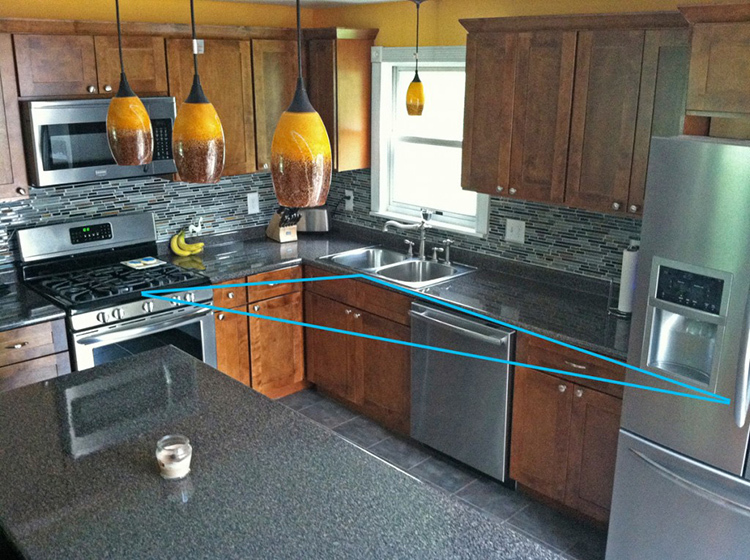
When setting up a kitchen, many people do not pay attention or simply ignore the so-called "working triangle". This is a space within which you can comfortably use the refrigerator, stove and kitchen sink. Each side of the triangle should be equal to 1.2-2.1 m. A smaller or larger distance will make the use of these elements uncomfortable.
Impractical materials
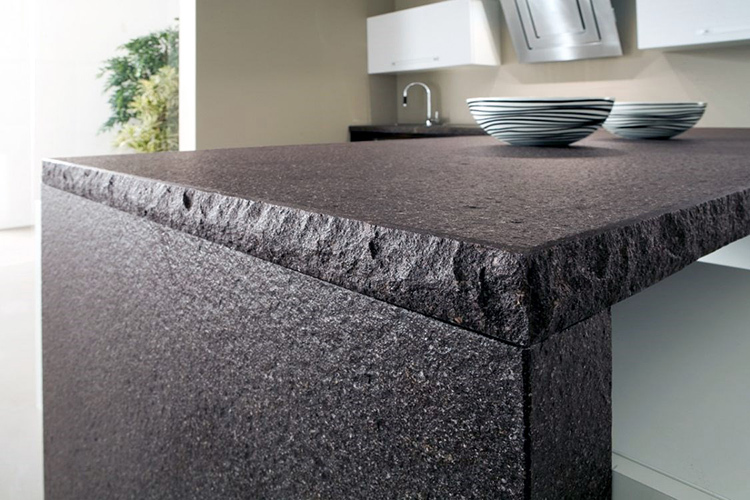
Using materials with a pronounced texture is one of the most common mistakes. Grease, moisture and dirt accumulate on porous surfaces, hot dishes should not be placed on acrylic, ceramics are afraid of impacts. And there are many such nuances, so before purchasing a headset, read the characteristics of the material and the recommendations of experts.
Lack of hood
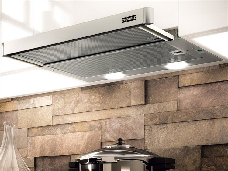
Most people consider the cooker hood to be an unnecessary element that takes up space and spoils the appearance of the interior. Quite a common misconception. The absence of this unit will not save much space, and modern models fit perfectly into any interior style. In addition, they will save the room from unpleasant odors, moisture and soot. The chimney can be masked with a decorative box or cornice made of the same material as the kitchen set.
Arch instead of the kitchen door
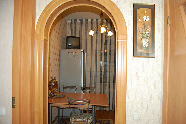
Dismantling the kitchen door is not a very good solution, unless this is due to the peculiarities of the layout: a studio apartment or combining a kitchen with a living room. Through an open opening, odors, moisture and extraneous noise from washing dishes, washing or dishwasher operation will penetrate into the living quarters. If, nevertheless, it is impossible to do without removing the door, then take care of installing a powerful hood.
Dark or glossy surfaces
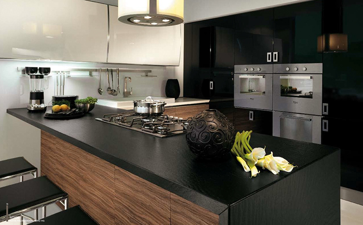
Dark or glossy surfaces of facades and countertops are not the best solution for a kitchen. It looks beautiful on photographs of catalogs and in furniture showrooms at exhibition stands, but in reality the situation is completely different. On such surfaces, dirt, scratches and fingerprints are more visible. You will have to constantly take care of the countertops and facades, devoting a lot of time to this, which you could spend on more enjoyable and useful activities. Give preference to matte finishes and lighter colors.
Large or small storage systems
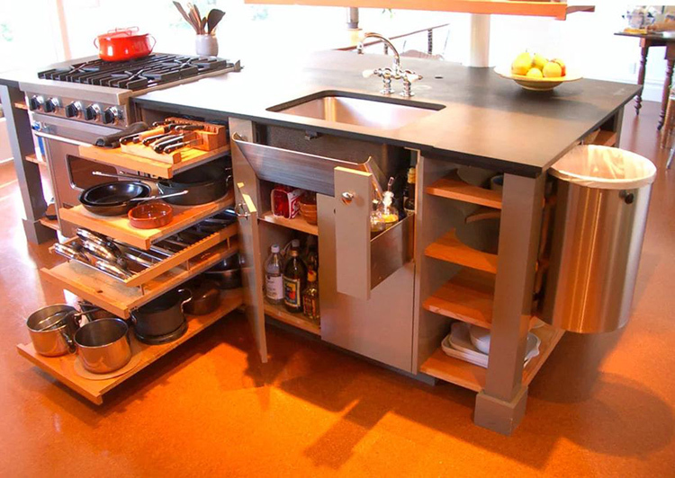
Many people, preferring to fit as many different items as possible in the kitchen set, therefore choose fairly spacious and large modules, regardless of the fact that the room itself is completely small. And it happens that storage systems in the kitchen differ in their modest size. This leads to uncomfortable use of furniture. This happens due to incorrect measurements, calculations and savings on the services of a professional designer.
Insufficient lighting
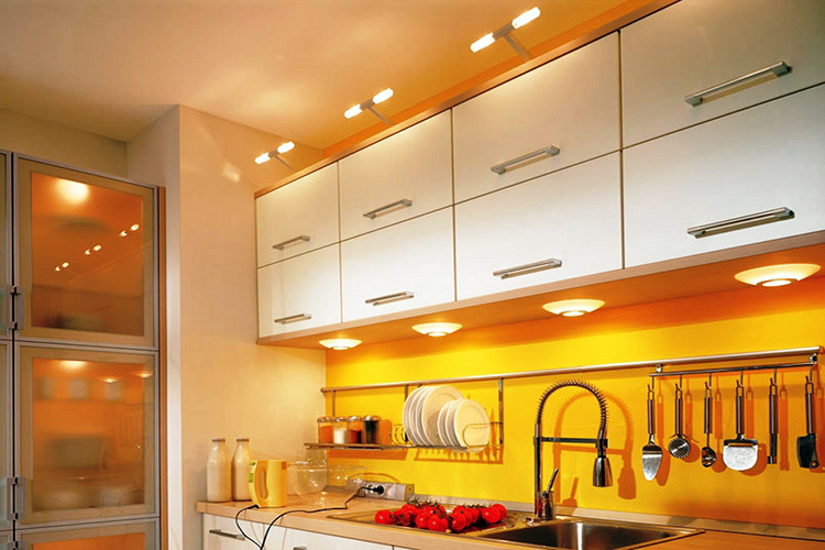
There is never a lot of lighting, but for some reason most people forget about it when equipping their kitchen, and are limited to one main lamp in the center of the room or above the dining area. However, this is not enough. Some headset models are equipped with lighting in a decorative cornice or two or three miniature daylight lamps. To save money, you can use the LED strip installed under the upper sections and behind the kitchen apron. You can also make additional lighting in hinged modules with glass facades and on the walls in the dining area.
Using bright colors
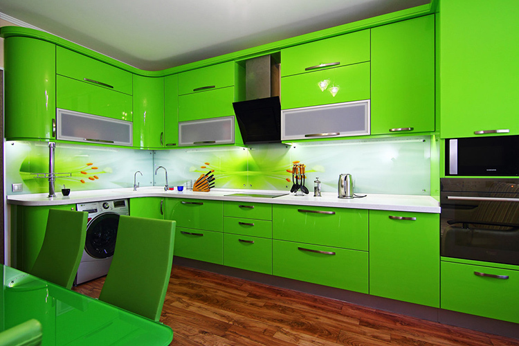
Despite the fact that bright, saturated, almost acidic colors are now popular, they are not the best solution for use in the kitchen. At first, the environment seems cheerful, but gradually you get used to it, and, as a result, it starts to annoy. It is better to use bright colors only as accents and then neutral, calmer shades. Warm tones are used in rooms with insufficient lighting, and cold tones are used in kitchens with south-facing windows.
Narrow aisles
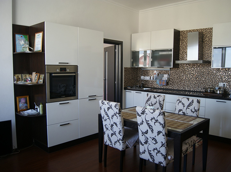
Often, when arranging a kitchen, especially a small area, the optimal distance between the kitchen set, dining table and household appliances is not observed. As a result, even in a spacious room, 2-3 people will move with some difficulty. The optimal passage width is considered to be 1000-1200 mm. This can be achieved by using a headset of shallower depth or a bar counter instead of a dining table.
Wrong choice of kitchen sink
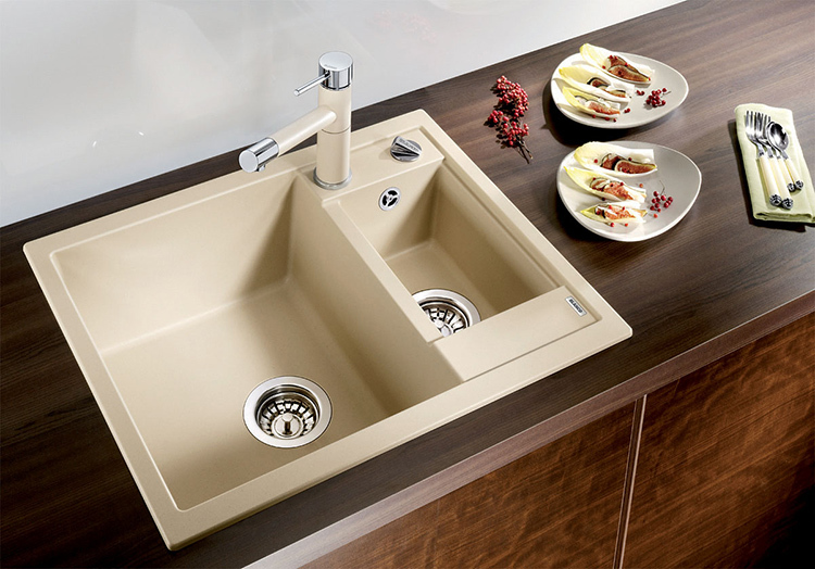
A lot of troubles and discomfort are caused by an incorrectly selected and placed kitchen sink. Often, in pursuit of beauty, we neglect practicality and ease of use. Give preference to deep sinks, those models that have a wing for draining water from washed dishes, as well as those with two bowls. It is better to choose the form of the sink that is more familiar to you, but do not place it strictly in the corner. This arrangement is not the most convenient and comfortable for the user.
Very high or low mixer on the sink
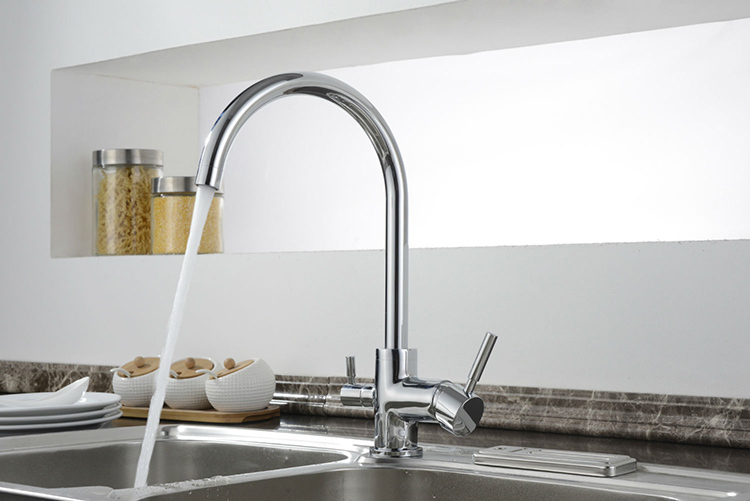
The tall mixer is beautiful, stylish and convenient because it, in combination with a deep sink, allows you to fill a large saucepan, vase or decanter. However, if the sink is shallow and the pressure is strong, then we will get water splashing in all directions. The disadvantage of very low taps is so obvious that it is not worth talking about. The optimal solution: select the mixer according to the size of the sink by purchasing a medium-sized tap or a product equipped with a retractable hose.
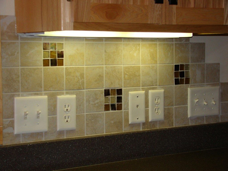
A small number and ill-conceived location of outlets
As with lighting, there are not many outlets in the kitchen. Traditionally, this room was equipped with 2 places for connecting household appliances, and if necessary, residents used "tees". If earlier this was enough, now with the increase in the number of household appliances used in each apartment, there is a need for more sockets. Now there should be at least 5 of them: refrigerator, hood, washing machine or dishwasher, stove, hood, etc. The height of the sockets is about 900 mm from the floor surface. Placement and wiring are best thought out and performed at the initial stage of kitchen renovation.
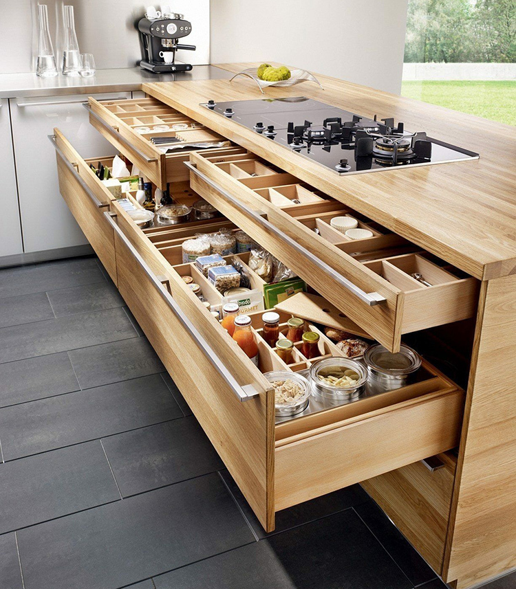
Drawers that are too deep or wide
Thinking that the more the better, we are doing the wrong thing, especially when it comes to furniture. A wide and deep drawer, loaded to the eyeballs, will be difficult to pull out, moreover, it can damage the guides or collapse the bottom. And filling the storage system to only half of it speaks of the irrational use of the available space. Choose modules with a width of no more than 800 mm and a depth of no more than 450 mm.
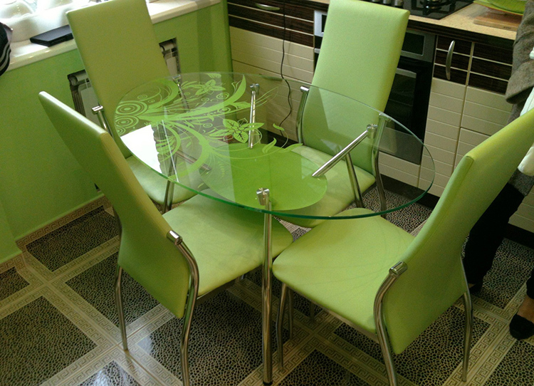
Glass table installation
In pursuit of fashion, glass dining tables are increasingly being installed in kitchens. Yes, they look beautiful and airy, fit into the interior of any style and do not overload the space. However, this medal has another side: it gets dirty easily, you cannot put hot objects on it.
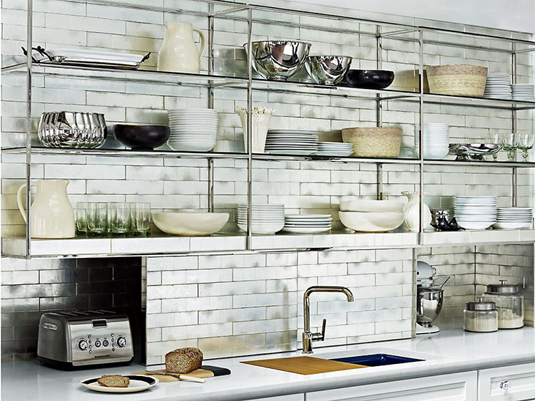
Replacing wall modules with open shelves
Fashion is fickle, so don't follow it blindly. In recent years, open shelves have been popular instead of closed hinged modules. After all, they are a real dust collector, especially if a large number of decorative plates, figurines and souvenirs are placed on them. Give preference to wall cabinets with glass fronts and decorative lighting.
A few words in conclusion
We hope that having learned the typical mistakes of kitchen arrangement indicated by us, you will be able to avoid them, making this room more convenient and comfortable.
If our article was useful and interesting for you, share your opinion in the comment form, we will definitely answer you.


