

- The simplest idea
- Arrangement of the room with wallpapers of two colors and more
- Combining the wallpaper of the interior: the rules of combining
- Successful variants of the combination
- The combination of wallpapers by the color scheme
- How to choose the color of wallpaper for different rooms?
- Options for using wallpaper to mask the weaknesses of
Decorating the walls of any room is a very important element of interior design. Today in the arsenal of professional masters there are many ways to decorate the walls - painting, decorative plastering, finishing the walls for concrete, decoration with 3D panels, wooden lining, ceramic tiles and, of course, wallpaper. We can mix different colors and patterns, combining them with decorative painting, plastering, and apply many other original solutions. How to choose wallpaper in a room of two colors, so that it looks harmonious and nontrivial? This article is devoted to the consideration of this issue.
to the contents ↑The simplest idea of
Before the wallpaper it is a task not only to decorate the walls, but also create the entire interior, giving it a certain style. There are many possible ways to use them. Choosing the type of decoration, we have a wide choice: you can paste over the entire wall or only one piece by combining it with another trim or creating contrasts between them.
The easiest way is to use wallpaper to cover all the walls in the room. You can use one type as the main background plus add decor in the form of a border or a decorative belt.
to the contents ↑Decorating a room with wallpapers of two colors and more
Creating a wall design with wallpaper of two colors, we can get a very interesting arrangement of rooms. When using several types of this finishing material, it is extremely important to choose their colors correctly:
- The best result will be when the wall is decorated with different wallpaper, which beautifully harmonize with each other in pattern, color. However, do not forget that it is not so simple to combine two patterns harmoniously. Therefore, if you want a decoration with a pattern, it is desirable to combine them with a monophonic surface.
Important! Expressive motifs, patterns are better to arrange with neutral and subtle patterns - thanks to such combinations, you can create incredibly beautiful combinations of wallpapers.
- It's very fashionable to combine different wallpapers on one wall. You can decorate whole walls with stripes or squares with different motives. But here it should be remembered that with this type of room design discipline is important, otherwise - it will chaos.
- Recently, the style of patchwork is gaining popularity in the decoration of walls. It makes it possible to combine many different patterns among themselves, but it is undesirable to combine more than two colors in this case.
- You can combine different patterns, cells, patterns, dots, flowers or stripes together. But it is necessary to allocate any one consecutive element in your interior, which will be repeated on them, as well as on some interior items. For example, it can be color.
Important! The most common option for combining two colors is to divide the room into two parts horizontally and finish each of them in two different colors and designs. Joints, which form between them, are decorated with a special decor. As a rule, the bottom is made darker, and the upper one is lighter, although other variants are possible.
The easiest way to realize this task is by choosing a finished collection, where the producer offers already competently selected and combined wallpapers and decorations for combining in one room.
to content ↑Combining wall-papers of interior: rules of combination
Combination of different types of wall-paper in an interior is a new direction in the world of design and repair, thus very successful. By combining the wallpaper with each other, we get an interesting view of the room with the opportunity to emphasize the dignity, as well as hide the shortcomings of the walls and the room as a whole.
Too dark room can be visually brightened, but too light - on the contrary, a little darken.
Options for combining wallpapers:
- Combining wallpaper by material - you can combine wallpaper of several materials: paper, vinyl, non-woven, wallpaper for painting.
- Combining wallpaper in color, shade - it is desirable to resort to using a spectrum of colors in order to find the most suitable color transitions.
- Combining wallpaper by texture - when combined on one wall wallpaper of several textures, ornaments.
Important! For any kind of wallpaper combination, you need to maintain the correct color gamut in order to have something in common, such as color, background, pattern or print.
to content ↑Successful variants of combining
Before you create a combination of wallpapers from several types in your interior, you should know the most successful and, most importantly, the most correct ideas and types:
- Combining wallpaper with inserts - using the base wallpaper color, breaking it with all sorts of insertsand other colors, textures or shades in any variation: vertically, horizontally, at an angle or - as you want.
- Combining wallpaper with pads - successfully performs the function of decorative decoration of the wall, used in the form of decor.
- Vertical combination - is a combination of the same or different in size, color, shade of wallpaper stripes vertically.
- Horizontal combination - finish the upper and lower parts of the room. As a rule, with the help of a horizontal line, the room is divided into two equal parts by the wallpaper, creating a background of the upper part of the walls, giving a certain coloring of the lower part.
Important! If you select wallpaper in a room of two colors horizontally, this somewhat obscures the area of the room - the height of walls and ceiling decreases visually, and the vertical combination-on the contrary, increases the area, the height of the ceiling and walls.
to content ↑Combination of wallpaper according to
color scheme As mentioned earlier, when combining wallpaper with each other, it is necessary to select one basic color, which will then be traced in the room and small interior details, and choose the appropriate colors from the spectrum that will be harmonious betweento combine oneself.
The spectrum of colors offered 9 primary colors: black, white, purple, blue, blue, green, yellow, orange and red.
On the color scheme, a combination of wallpaper can have several options:
- A simple combination - two adjacent colors on the spectrum;
- A complex combination - several colors at once;
- Bold combination - the combination of opposite colors in the spectrum.
To choose the right wallpaper in a room of two colors or more:
- For a room with a small area, it is desirable to choose a wallpaper of light colors, but in large rooms with color you can experiment.
- If the room is decorated in light and calm colors and in the same color scheme, it is desirable to choose the neighboring colors in the spectrum of green and yellow, for example, their shades.
- Well, if a room is created with dark wallpaper, then they should be combined with opposite colors in the spectrum.
How to choose the color of wallpaper for different rooms?
Naturally, any color recreates this or that atmosphere, so you need to choose wallpaper in a room of two colors for a nursery or a living room in different shade scales. Consider the following options.
Children's room
Increasingly, they use zoning of different sites, which directly depend on their destination. To do this, the wallpaper should be of two kinds:
- in the work area( zone of classes and active games) with rich and bright tones;
- in a rest zone( a place for a dream) - quiet tones with white, yellow and beige hues, without bright and large drawings.
Important! Suitable paper linens or vinyl-coated with a special children's themes, depending on the sex and age of the child. Up to 2 years it is better to use unsaturated soft tones, from 2 to 8 - coverings with cheerful drawings that will develop the imagination and horizons of the child.
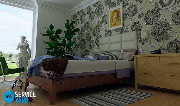
Bedroom
Any wallpaper, but it is better to use linen with non-woven coating or silkscreen. For this room is most successful pastel gamma tones. The ideal solution is to decorate the room in blue tones, which will create a feeling of coolness, which will help keep the nervous system in tone.
Hall, living room
You can also use any options here. Since in the hall or in the living room all the celebrations and receptions of guests are mainly held, for a refined interior the ideal solution will be velor canvases, foil wallpaper imitating the decoration with gold leaf or silkscreen.
With regards to the choice of colors - there are no strict rules, the main thing is to create an attractive and festive room. Light linens of pastel and warm tones visually increase the room and lighten it, and beige, sandy, grayish - will make the living room or hall light and spacious.
Kitchen, corridor and hallway
These rooms are most prone to contamination, so it is best for them to use such wallpaper, which can be further washed or wiped with a damp cloth. For these purposes, thick kitchen vinyls, designed for painting or silk-screening, are good.
As for the shades:
- For the kitchen, all warm tones are perfect: yellow, red, orange, which will contribute to a good mood and good appetite.
- In the hallway and hallway, dark shades look the best, but they should not contrast with other walls of the room.
Options for using wallpaper to mask the weaknesses of
Decorative wall finishing should be dealt with after the leveling of the surfaces is completed. However, it is not always possible to completely hide the flaws, and sometimes they become visible already in the process of work.
Here there are their tricks:
- They can be hidden with wallpaper of dark colors - against their background, dents and ledges are less visible.
- If the dark colors do not fit into the overall design, you can fix the flaw using textured wallpaper. You will be helped by vinyl, fiberglass products and non-woven base. Their textured surface will hide minor irregularities under a rather thick embossed cloth.
In old hruschevkah often there is no right angle between the ceiling and the wall. This rounded smooth transition can be stylishly and effectively beaten by wallpaper of different colors, for this you need:
- Gluing the surface with one-color colorful wallpaper to the level at which the curvature of the angle between the ceiling and the walls begins.
- Cover this gap with a white canvas.
- Stick on the molding at the border of the color transition.
In this design can be used canvases of one or different types, for example, silkscreen or a combination of paper and vinyl wallpaper.
Important! Properly selected combination will help correct incorrect lighting of the room. Areas where the bright color falls are pasted with matte surfaces and dark colors. If there is not enough sunlight in the room, use wallpaper with a reflective glossy surface.
As you can see, there are a lot of options how to choose wallpaper in a room of two colors and more. Be based on your own perception of different shades, on what feelings they cause in each of your family members, what result you want to achieve - to make the interior brighter, or vice versa - quiet. Do not rush to immediately use the first combination you like, try to leave in a prominent place the samplers for a few days in the room where the repair is planned. And only then, if nothing more interesting you did not like, and the chosen combination did not start to irritate, get down to work. Successful repair!