Valeria and her husband, Iosif Prigozhin, never wanted to buy expensive housing on Rublyovka or in other elite areas, but they did not refuse wealth and luxury in the interior. Now the stars live in a standard Moscow business-class high-rise building, and Gaban was invited to design the interiors About Keefa, a famous British designer who has designed for many celebrities, including Elton John.
Read in the article
- 1 Apartment layout and luxury design
- 2 Design features and main "chips"
- 3 Living room and bedroom decor
Apartment layout and luxury design
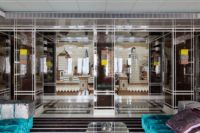
The apartment of Valeria and Prigozhin is about 300 square meters. On such a large territory, it was easy to place several bedrooms, a living room, latrines, a library and an office. Experts tried to give an estimate of the cost and estimated the apartment at 567 million rubles, but the singer herself rejected this estimate, saying that the price of her housing is much less. Valeria and Iosif did not save on the design of the apartments - they chose only the best, most expensive furniture. One of the features of the apartment is a giant panel with a city panorama, which is not just a decorative element, but also a functional thing that separates the living room from the kitchen.
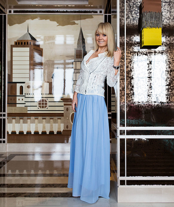
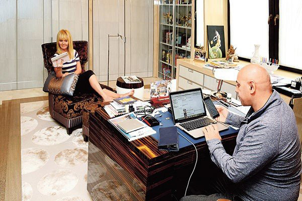
The overall design deserves special attention – solid white oak was used in the decoration of the corridors, and the stars ordered marble for the bathroom. In his office, Iosif Prigozhin put a table upholstered in eel skin - he decided not to deny himself luxury.
Interestingly, some time after the settlement, the star couple wanted to sell the apartment. The apartment was even put up for sale at a cost of 770 million rubles, but no buyer was found and Valeria and her husband changed their minds about moving.
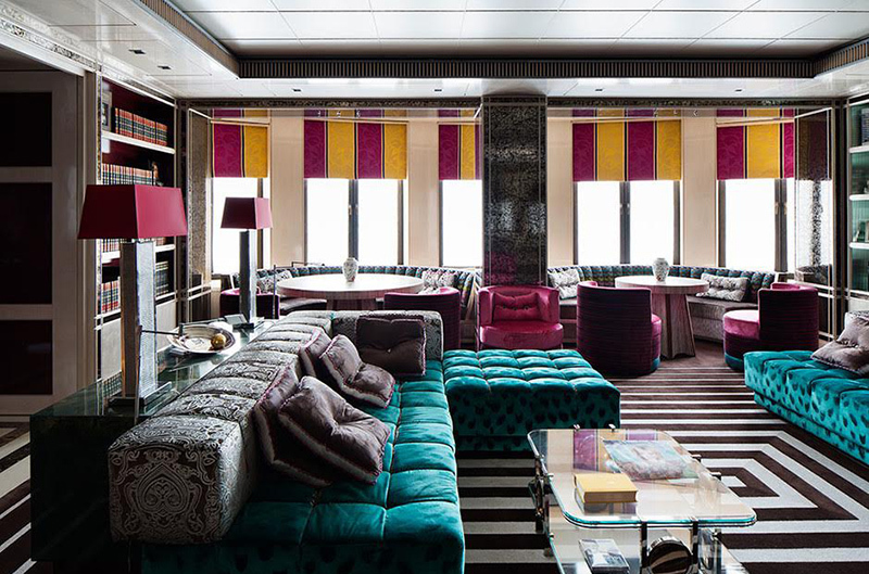
To decorate her apartment, the singer decided to invite a famous English designer, the project was developed by Gaban O Keefe. As conceived by the singer and designer, the apartment resembles a luxurious ship. There is a special symbolism in this design for the residents of the house - the apartment became the birthplace of their family, like an ark in which Valeria and Joseph waited out difficulties and troubles.
Design features and main "chips"
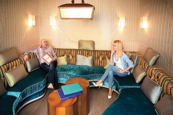
The interiors that Oh Keefe creates differ from many others in that they are created “on the edge”. This is pure eclecticism and a combination of items that at first glance cannot be combined in any way.
However, despite the fact that bright, "flashy" colors are used, the rooms do not look crowded with details, in they are very comfortable and calm, and the owners of the apartment can relax after a hard day's work, lose voltage.
The main problem faced by the owners of the apartment is a small number of windows. To avoid the effect of eternal darkness, a huge number of lamps had to be installed.
The entire space of the apartments is divided into two parallel axes - on one of them there is a dining room and children's rooms, and on the other - a kitchen, library, bedrooms. The kitchen is located exactly in the middle.
Living room and bedroom decor
One of the design features is the use of the marquetry technique, with the help of which an unusual effect was created - the feeling of being not in a house, but on an observation deck in a metropolis. This effect is achieved through the use of glass.
The main elements of the apartment:
- the living area is furnished with soft sofas and decorated with oriental ornaments;
- vintage notes can be traced in individual elements - soft pillows, mirrors in aged frames and carved clocks;
- the dressing room is finished with beautiful materials in silver and blue hues;
- the bedroom, unlike other rooms, is made in dark colors - the main notes are coffee and purple;
- Being in the living room, you can feel like you are on the roof of a skyscraper - this effect visually expands the space, which is already abundant in Valeria's apartments.
Just look at the photos to immediately notice the "hand" of a famous designer - to achieve this a beautiful combination of shades that do not match each other in the palette is not as simple as it can to appear. So that the apartment does not seem oversaturated with details, the designer diluted the bright colors with others, more calm, for example, gray and white, light brown and blue.
Despite the fact that Valeria and Iosif planned to sell the apartment, they are very fond of this design and as a result decided not to abandon the housing that they had been choosing and equipping for so long.
Did you like this unusual design? What would you keep or take away?
Wicker fence is a waste of time and money. When we were equipping the site, we bought: up to ...
6 acres is a fairly small area, so there were no problems with zoning ...
Those who usually suck at life really do not understand a lot of things. And in general they regretted ...
That blogging shit again... Suck on!!!
I just can’t understand: where do juvenile cockerels and swallowers get such incomes from? Who encourage...
Basements in cities and private houses should not be built, they are often drowned. Regarding similar...
There was an idea to buy a country house with a carport. We found an interesting place near the…
We have been wanting to buy a painting on canvas for a long time and recently we were pleased with this by the company Va…
Didn't like the renovation. The kitchen is narrow, it was necessary to visually solve this particular pr…
unlike the palaces of our president's friends, this is just a miserable hut, albeit in style ...
and if the top layer of foam is not broken, then the lacquer surface greatly reduces the hygroscopic ...
strange reasoning regarding sealing. If the log is doused with sealant, foam ...
