It is impossible to keep track of all the new design ideas in interior decoration, and it is not necessary at all. It is enough just to get rid of a few elements in time that only spoil the external perception of the situation. Imitation of classics, "grandmother's" carpets on the walls, old dishes or curly ceilings - all this ostentatious stupidity is no longer relevant. Today, in the HouseChief review, we will tell you about 10 items that do not make the interior more expensive, on the contrary, the furnishings look unpresentable and cheap.
Read in the article
- 1 Cheap switches and sockets
- 2 Economy class fittings
- 3 Poor lighting
- 4 Cheap decor from a hypermarket
- 5 Mass market textiles
- 6 Disorderly arrangement of things
- 7 A designer's terrible dream - fridge magnets
- 8 Poor choice of dishes
- 9 Imitation of a modern loft
- 10 Inappropriate interior items
- 11 Conclusion
Cheap switches and sockets
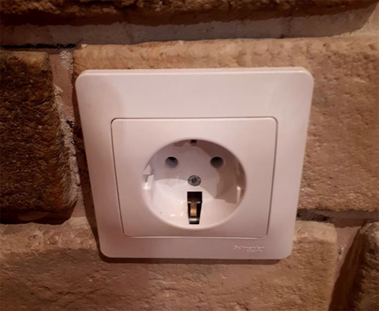
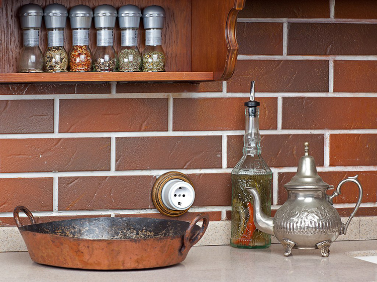
Many do not attach importance to trifles, in the opinion of the owners, the details are not so striking, which means they should not be spent on them. This is a misconception, since the mood and atmosphere in the house is just made up of details. You should not save on sockets and switches, branded items, including those made by to an individual order, will give the impression of a high-quality and stylish renovation, even if it was carried out some years ago.
Economy class fittings
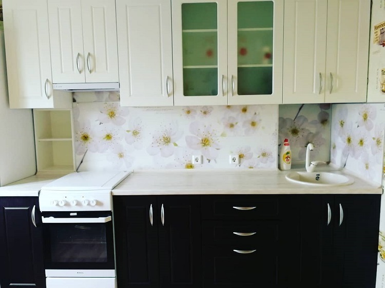
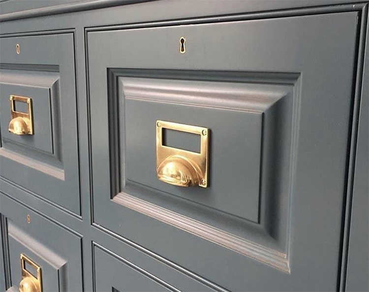
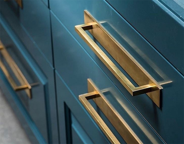
Another detail that seems insignificant at first glance is the fittings. This includes not only the handles of kitchen cabinets, but also interior doors. Cheap counterparts will simplify the appearance of furniture, in particular, and the interior as a whole. Try to immediately replace the elements in finished products with more expensive and high quality ones. This will give the environment a sophisticated and unique look.
Poor lighting
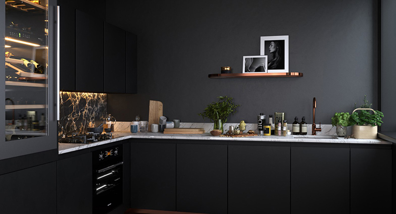
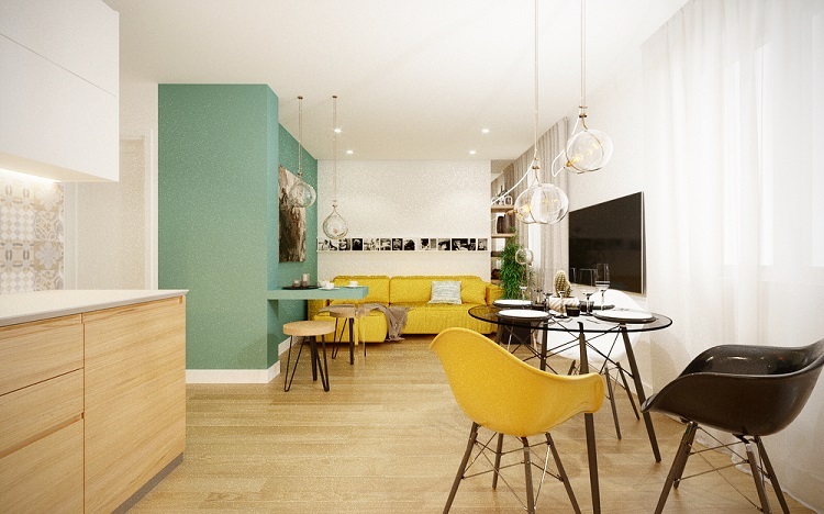
Lighting plays a huge role in the interior. A scanty, lonely chandelier will make the atmosphere gloomy and inhospitable. Designers recommend thinking over several scenarios in advance for each of the functional areas. Here are the most common examples:
- to illuminate the soft area in the living room, it is better to put a floor lamp, table lamp or sconce in addition to the central chandelier;
- in the kitchen, be sure to install several lamps to illuminate the working area;
- for the dining area in the kitchen, a sconce or a couple of small lamps hanging over the countertop is suitable.
Important! Dim lighting not only makes the environment cheaper, dark corners visually eat up the space.
Cheap decor from a hypermarket
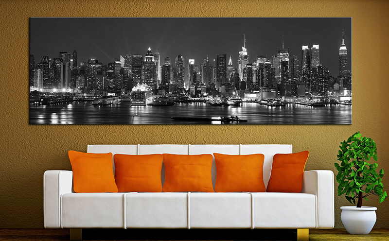
The worst thing that can happen to your design is decorating your interior with cheap posters or hypermarket illustrations. For example, items from IKEA are found in every second retail outlet or cafe, then what kind of uniqueness can we talk about.
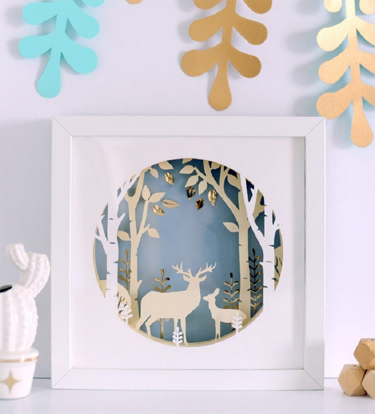
If, in your opinion, the decor from the hypermarket is ideal for your interior, try to choose things that are less recognizable or those that you can modify or change on your own. For example, insert a poster into an original frame or choose an unusual candlestick for candles.
Mass market textiles
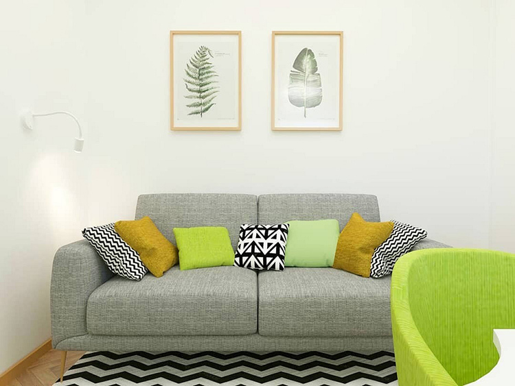
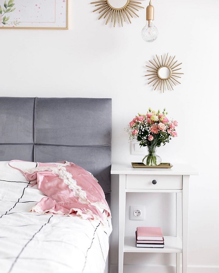
Textiles give uniqueness to any interior, therefore, treat its choice with maximum attention. Decorative pillows, carpets, curtains, tablecloths and blankets will add a unique flavor and personality to the environment. You can pick up several sets for special occasions and everyday use.
Disorderly arrangement of things
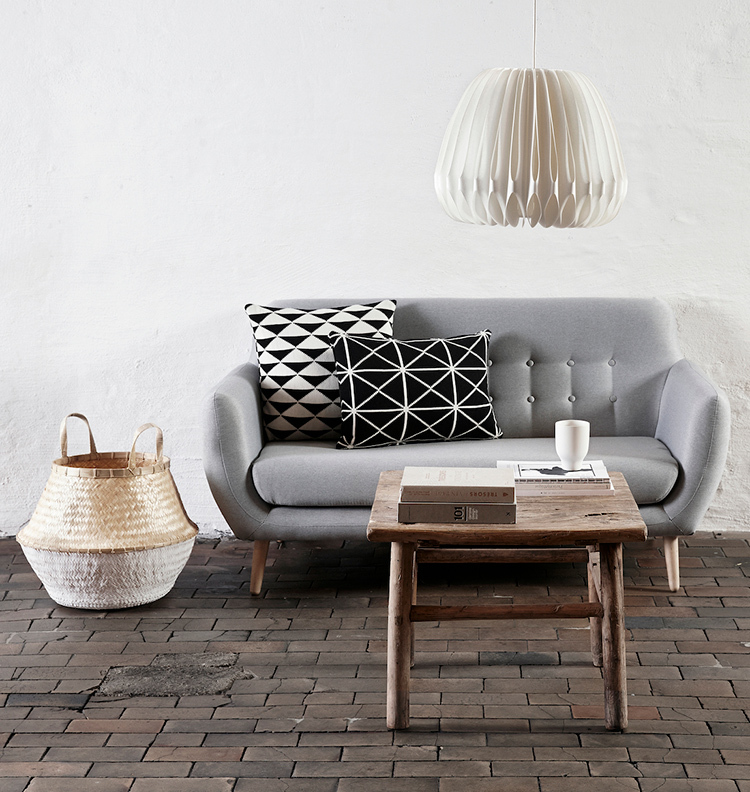
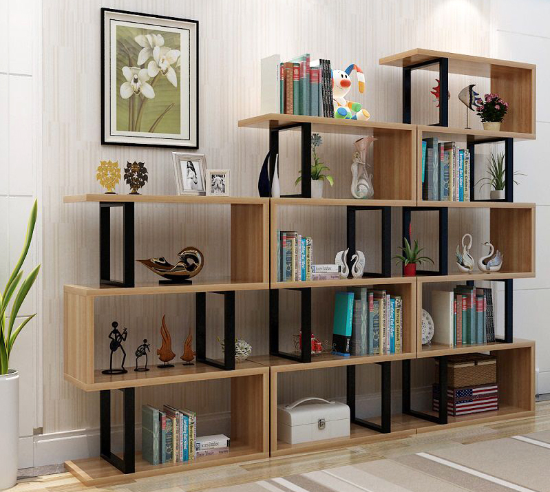
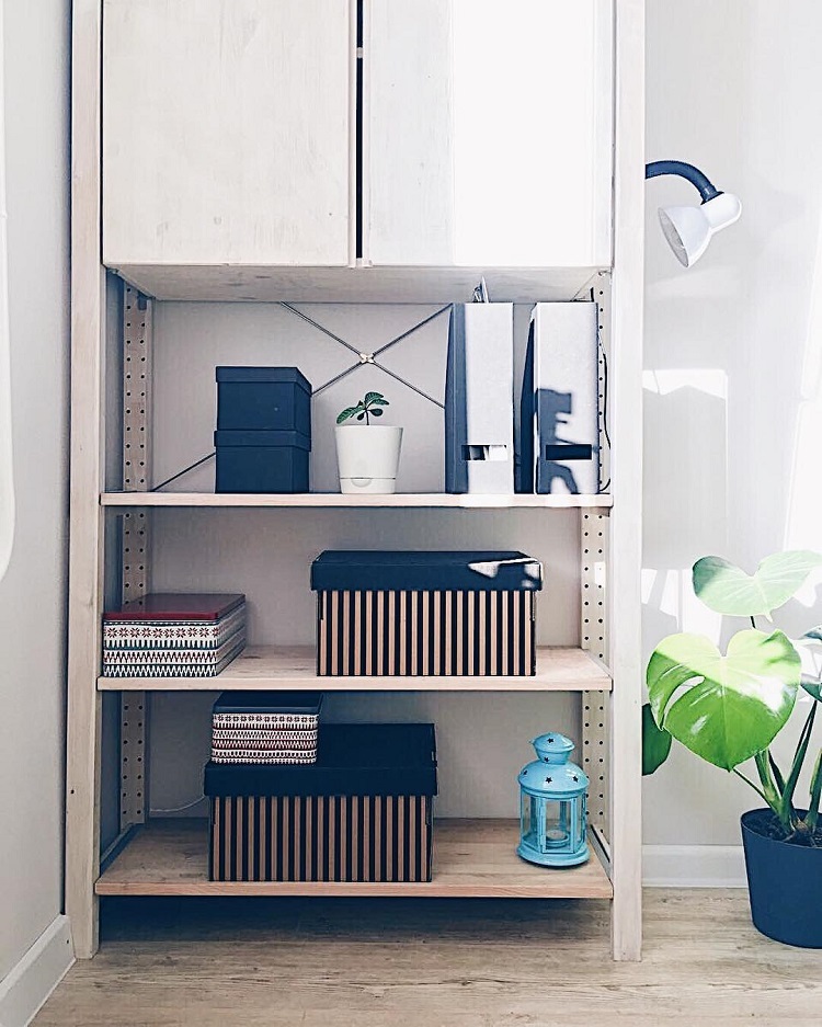
Chaotically arranged things will ruin the most expensive shelving unit, open shelf or countertop. All decor items should be combined in style, design, color scheme and purpose. The rule applies here: less is better. It is enough to pick up 2-3 large elements and distribute them in the center, leaving the edges free.
Another problem is the messy storage of books, magazines and newspapers in open spaces and shelves. Even a couple of casually scattered publications will bring the appearance of chaos in the interior. This can be minimized by purchasing several baskets, containers and boxes of the same type.
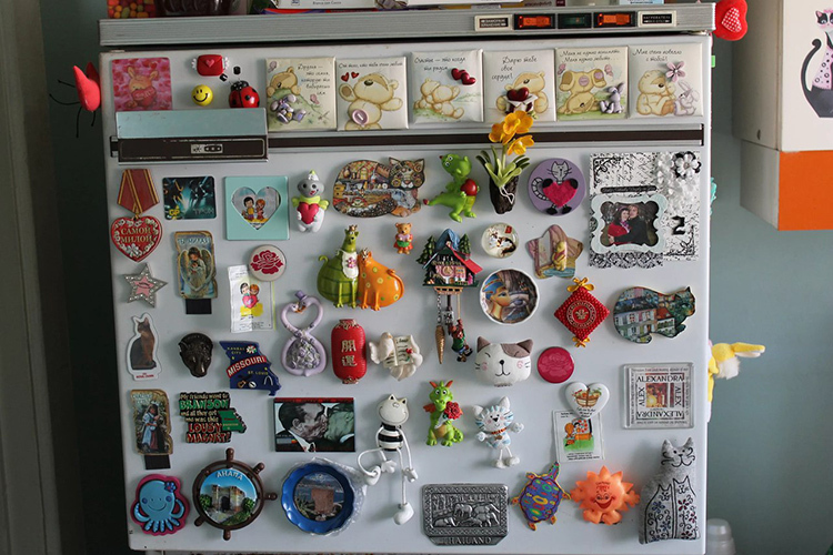
A designer's terrible dream - fridge magnets
Until now, many bring original fridge magnets from travel, for some, the entire panel looks rather motley and untidy. In addition, when you open the door, sometimes a little noise is created, which does not contribute to proper rest. But how often do we look at such trophies? Probably not, then why do we constantly replenish our collections.
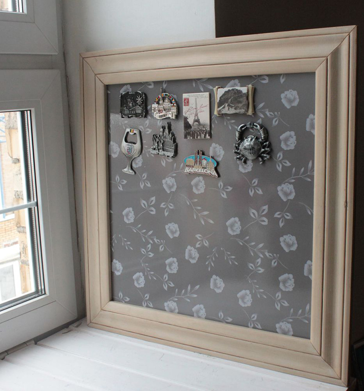
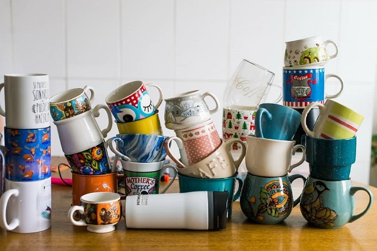
There are two ways out here: buy a special board for the magnets in a beautiful frame and fix it in a more suitable place. The second option is to stop buying useless gizmos and bring something substantial, such as spectacular cups or pretty towels.
Poor choice of dishes
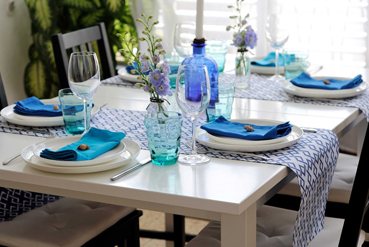
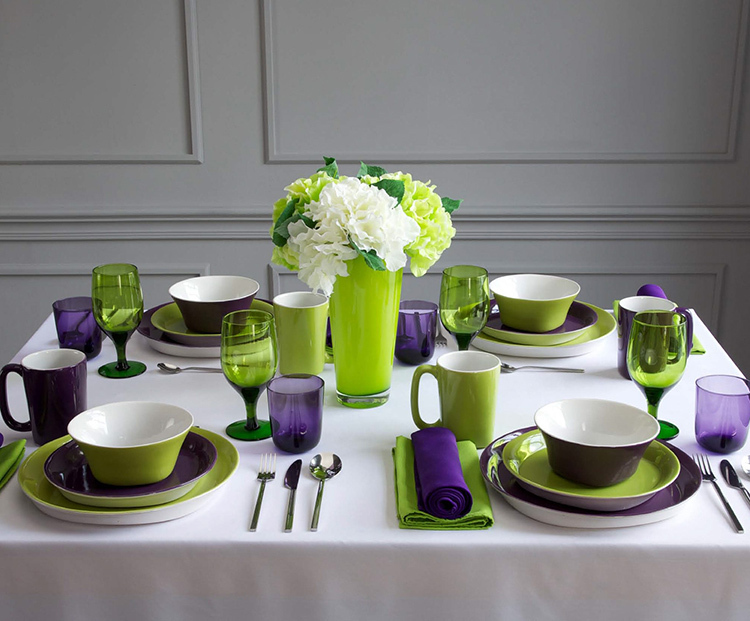
A cheap and outdated interior is produced by dishes that do not match either with each other or with the style of the room. The ideal option is several sets of similar design and shades that can be combined for table setting. Textiles will help create a unique and elegant composition.
Imitation of a modern loft
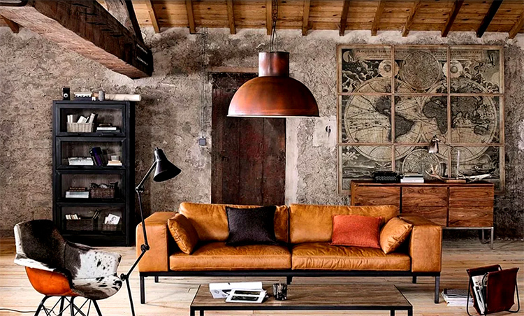
It seems to many that loft - this is the simplest, most affordable and affordable style for interior decoration. This is a misleading opinion, since a homemade table made of boards or a bed frame made of pallets is not an industrial design at all. The result is an uncomfortable interior that smacks of tastelessness and cheapness.
A loft requires a competent approach and a careful choice of finishing materials and pieces of furniture. The result will be a completely non-budgetary repair that requires special preparation. It is much easier to choose more affordable directions, for example, Scandinavian style or eco-design.

Inappropriate interior items
Misplaced details greatly simplify interior. Here are some examples:
- abstract drawing in classic design;
- massive chandelier with crystal trimmings in a small space;
- African contrasting prints in minimalism.
And the list goes on and on. Bold and original combinations are appropriate only in some designs, for example, in eclecticism or fusion. Sometimes it is better to seek professional advice or choose proven techniques.
Conclusion
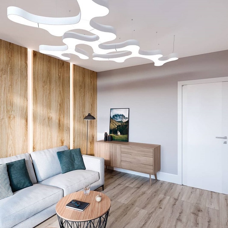
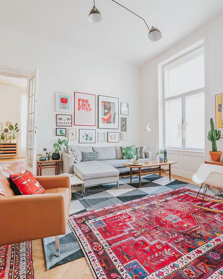
Today, designers point out that rigid frameworks for interior decoration are receding into the background. The monotonous style is replaced by a competent mixture of directions. All additions should be made concisely so that the composition looks natural and comfortable.
Share in the comments what else, in your opinion, makes the interior outdated and boring, and what details you can get rid of with minimal losses.

