The 2020 interior is still characterized by such an organization of space as “Open space”. This trend is chosen by single people and childless couples who lead an open lifestyle and often host guests.
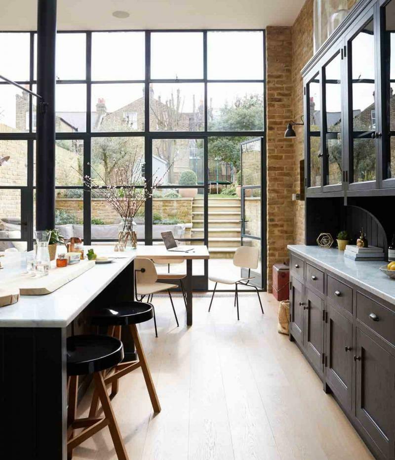
A modern kitchen should be comfortable, functional and attractive
Overview of fashion styles
Content
- Overview of fashion styles
- Industrial style
- Scandinavian style
- Shaker
- Eco style
- Postmodern
- The current design of the kitchen-living room
- Color palette
- Lighting
- Arrangement of equipment
- How to arrange furniture
- Video: A selection of fashionable kitchen interiors
- Photo: 50 ideas for modern kitchen-living room design
Industrial style
The industrial-style interior is laconic. There are no excesses of decor, but all the basic elements are available. The presence of concrete or brick walls is characteristic. The floor is made of planks and the furniture has a rough texture. Beams, pipes, metal are used as decorative elements.
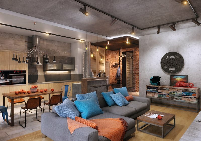
Industrial-style interiors require space
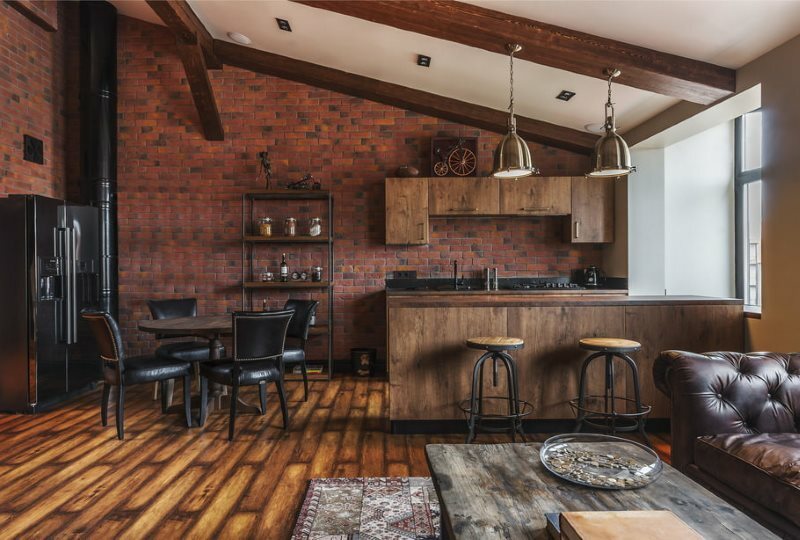
Wood and brick, concrete and metal - perfect combinations for industrial style
Scandinavian style
Those who prefer minimalism are attracted by Scandinavia. This design uses a cool color scheme. Popular colors: white, blue, gray, brown, milky, shades of yellow. There is an abundance of light in the interior. Of the materials, the most preferable are: wood, plaster and brick. The touch of “wildness” in the interior is very appropriate.
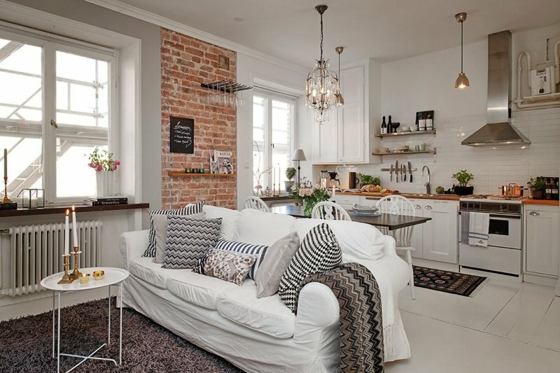
In Scandinavia, it is customary to combine beauty, convenience and environmental friendliness.
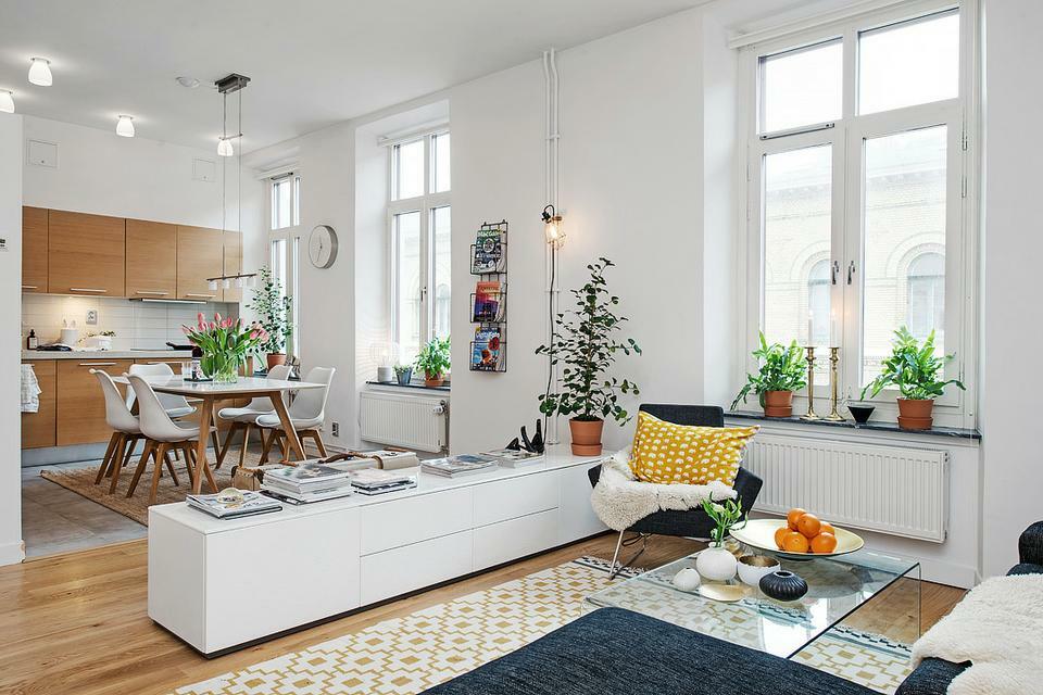
The room should be well lit, you can completely abandon the curtains
Shaker
This style is characterized by floor-to-ceiling wardrobes. Sections of different sizes allow you to equip storage space. The furniture is upholstered with natural fabrics at an affordable price. Preferred colors: white, yellow, brown, green, blue. Light varnish or paint is used as a finish. The abundance of natural textiles gives the feeling of warmth.
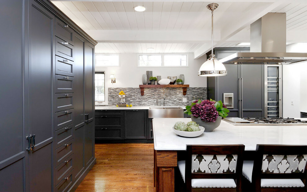
This style is characterized by clean simple lines and quality materials.
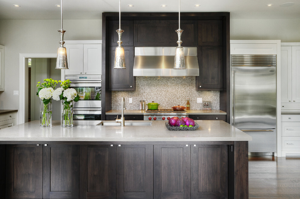
When choosing furniture, preference is given to simple but functional items
Eco style
The popularity of natural building materials is understandable, since there are already enough synthetics in everyday life. With the help of unpretentious interior decoration, you can get closer to nature, get its energy every day. Natural motives are characteristic of the eco-style, as is the moderate landscaping of the room. Adding small elements to the interior refreshes the style without detracting from the functionality.
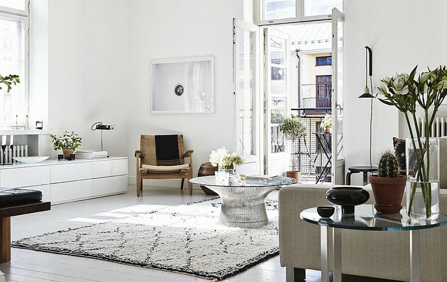
Eco-style welcomes warm colors both in the main interior and in the decor
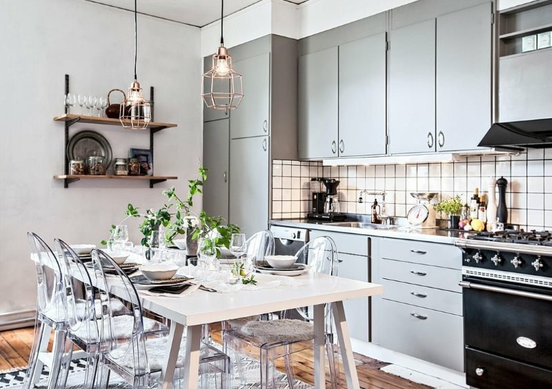
Eco-style can be interpreted in completely different ways, but in any case, the priority is for natural materials.
Postmodern
In the interior, postmodernism manifests itself as an ultramodern solution. It is characterized by the use of multicolor, contrasting combinations, asymmetry. The presence of disproportionate furniture is also characteristic. Energetic colors: yellow, orange, turquoise, aqua, pink, red, indigo, silver. Combined lighting is often used. Combination of 3d panels with wood and plaster is typical. To highlight the style solution, it is recommended to use a podium, a multi-level ceiling and a backlit niche.
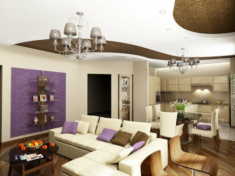
Postmodernism is characterized by a free layout and a non-standard view of ordinary things.
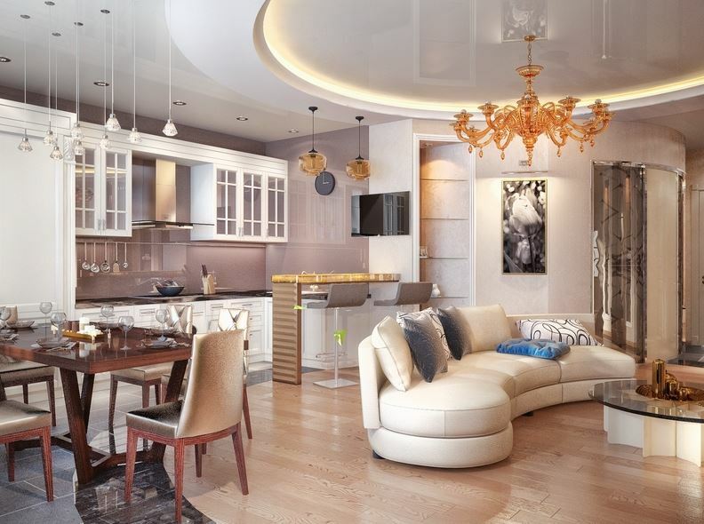
Materials for finishing and upholstery of furniture - artificial leather, chrome elements
The current design of the kitchen-living room
Designers are actively using zoning as the most effective way to organize space. To distinguish between the living room and the kitchen, a green area is usually organized.
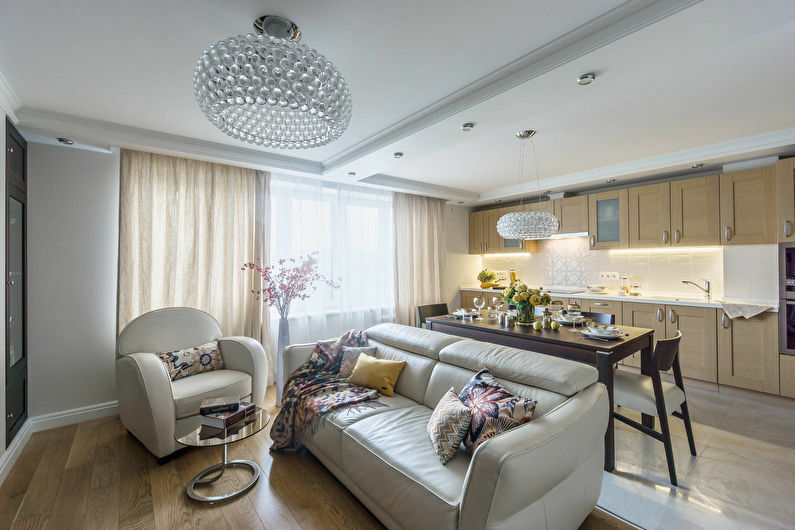
Combined space requires a rational approach to planning
Basic design techniques:
- Prioritization. The kitchen area is of particular importance and has a large area.
- Combining space. The premises are combined using a single color scheme and adjacent furniture elements. You can create a single ensemble in the interior using a rack. Also, for this purpose, use a bar counter or sliding partitions.
Advice. If the room is small, then it is advisable to install a peninsular structure, which rests against the wall with one side.
In a typical dining room kitchen design, as in photo 2020, modern ideas allow you to add a fresh note. For example, you can set aside a corner in the kitchen for a snack.
The space under the island structure will serve for utensils. The mezzanine located under the ceiling will add even more functionality. The trend is a kitchen set with voluminous doors, which can have a glossy or glassy texture, preferably dark.
Example: Living room kitchen design. Photo 2020. Modern ideas.
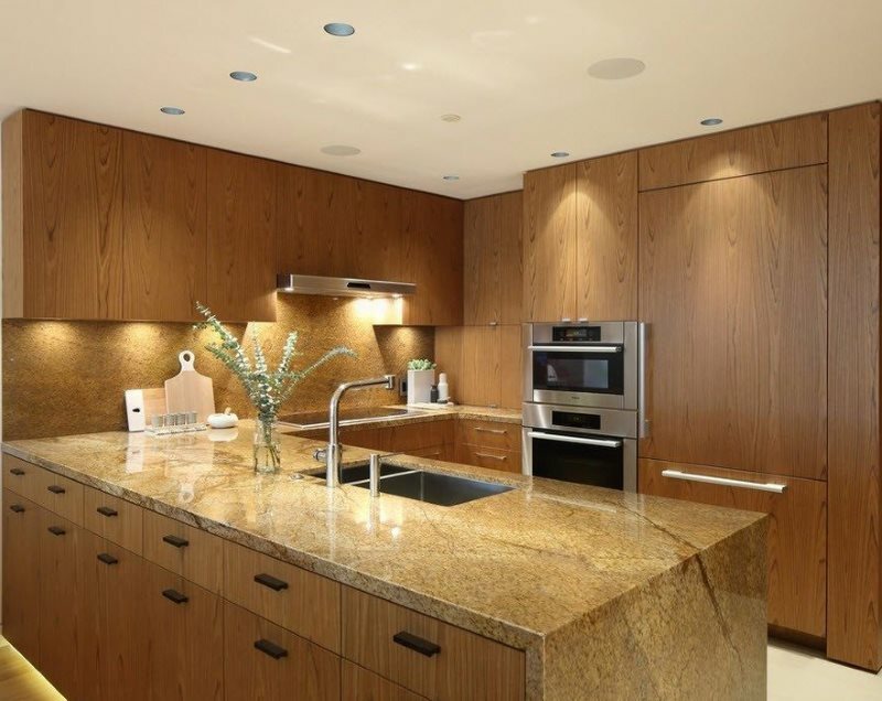
The peninsula is quite suitable for organizing a comfortable working area.
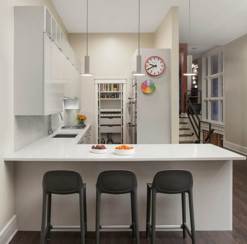
A bar counter is often placed in the form of a peninsula.
Color palette
As in the previous season, contrasting combinations do not lose their relevance. Light colors are combined with graphite gray, black and dark chocolate shades. The combination of colors is able to emphasize the design of the combined space.
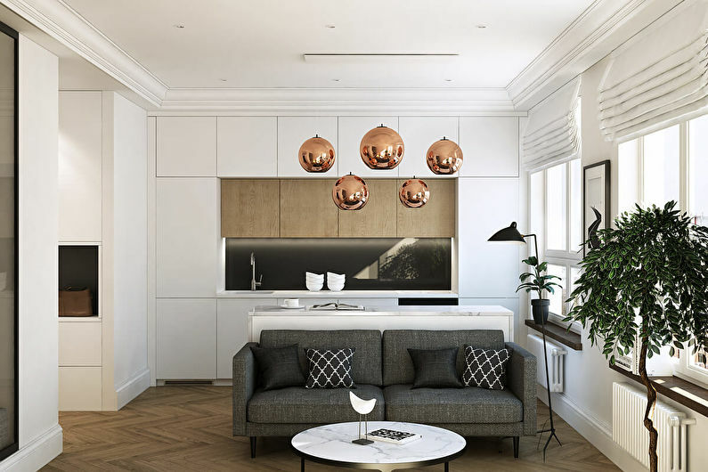
In a confined space, most of the interior should be light
All furniture should be designed in the same style, consistent with the overall range. A muted range for decorating zones: lavender, gray, white. Cool and contrasting shades: mint, lemon, matte white.
It is recommended for dynamic people to choose a brighter gamut, or to accentuate by combining colors. Example: interior made in gray and yellow tones. Gray is used as the main color, while yellow is the accent that "enlivens" the room.
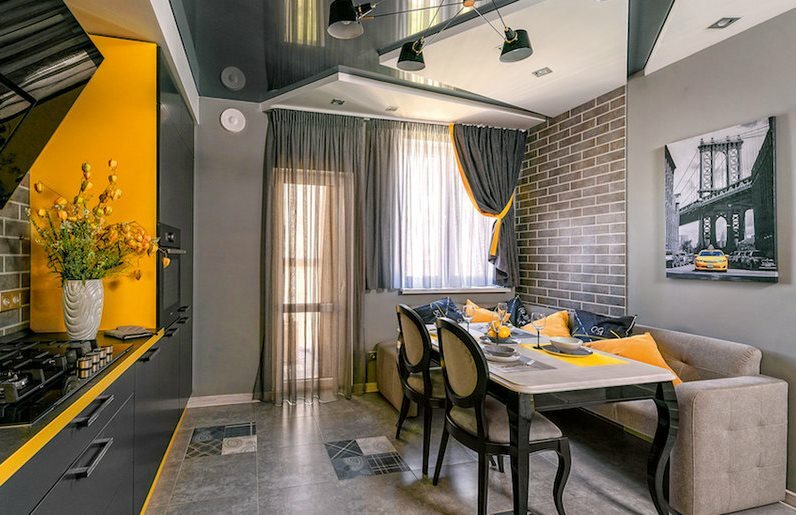
To revive the interior, you need very little - a couple or three successful accents
In the trend of 2020, smooth color transitions. This effect is easy to achieve if you paint the walls in a gradient technique or in ombre. Silver highlights on plain surfaces are also popular.
Example: Kitchen living room. Photo. 2020 design. New items.
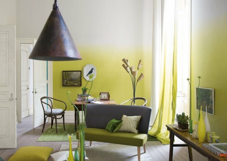
The ombre effect is most noticeable on walls, but here it takes experience and patience.
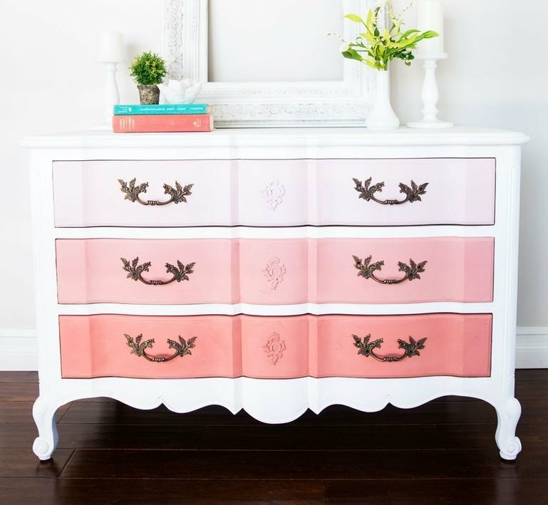
It is much easier to make color transitions on pieces of furniture.
Lighting
There should be enough lighting contours in the room. Each zone contains the main and additional lighting. A typical solution for the kitchen is lighting with LED strips along the contour of the bar counter (if any) and along the bottom of the upper cabinets.
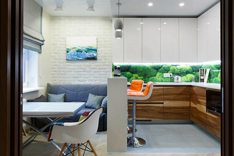
Artificial lighting should be different - use different lighting fixtures in each functional area
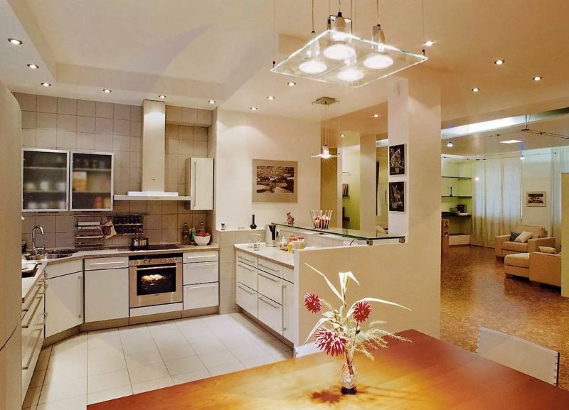
It is especially important to highlight the working areas of the kitchen with high quality.
With the help of light, the dining area is highlighted. Several identical lamps are used, which are casually hung in the center of the room. Geometric models are in trend. The backlight serves as another zoning fixture. Designers recommend both spot and strip lights. Particular attention is paid to the recreation area, which should be additionally illuminated using a floor lamp or sconce.
Arrangement of equipment
Functionality is trending. The rule of the working triangle applies here. Ideally, the storage area, the cooking area (sink) and the hob form an isosceles triangle. The distance between its “tops” is 1.5-2 m.
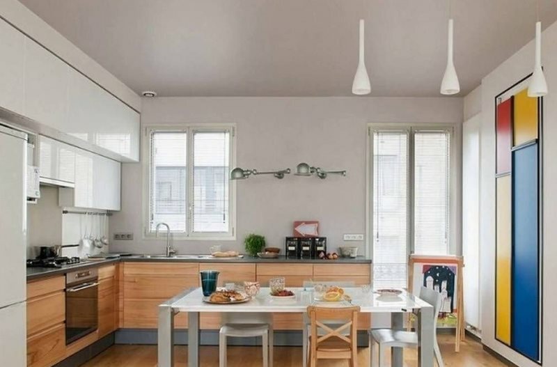
The working triangle “looms” ideally in the kitchen with an angular layout
The hood must be strong, covering the hob. This is done to neutralize odors as much as possible.
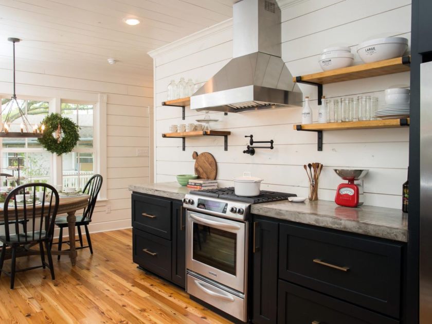
In the process of cooking, not the most useful vapors are released, a good exhaust hood will largely prevent their spread throughout the apartment
Their own sources of lighting are installed in each zone: in the place where food is prepared, in the dining room, in the recreation area. Example: a luminaire built into a dryer module aimed at a sink.
How to arrange furniture
Starting furniture, you need to exclude the joint use of furniture and kitchen storage systems. Built-in furniture is preferable, giving more space, as well as designs with sliding doors.
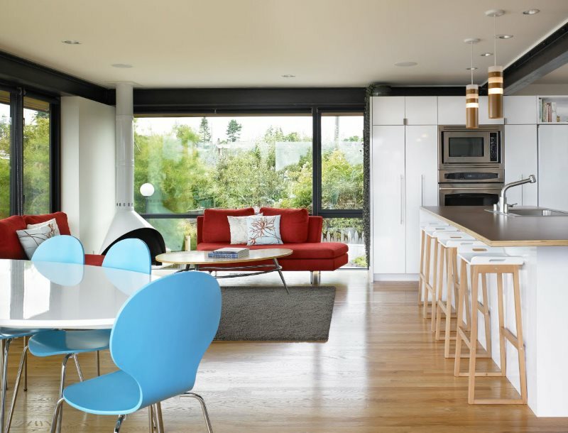
Built-in furniture is relevant for modern stylistic trends
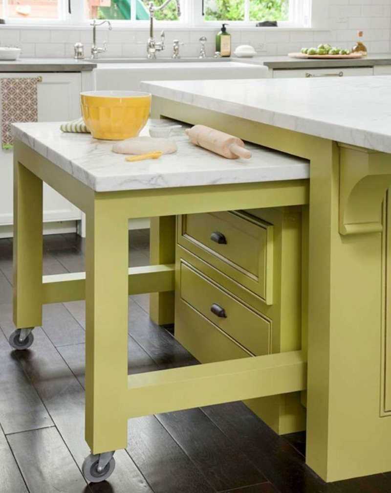
Various types of pull-out designs are very convenient, for example, like this table on wheels with an additional work surface
It is enough to put a sofa and a coffee table to create coziness in the interior of the living room kitchen. Photo 2020 demonstrates how to implement zoning. It is recommended to unfold the sofa so that its back is located opposite the kitchen unit. Massive bookcases are not recommended to be placed in the areas of the room - their place is in the hallway or on the loggia.

The sofa is great for zoning the kitchen-living room space
So, the new interior of the living room kitchen is ergonomic, but at the same time functional. It is recommended to reject the monotony in the interior and appeal to individuality.

